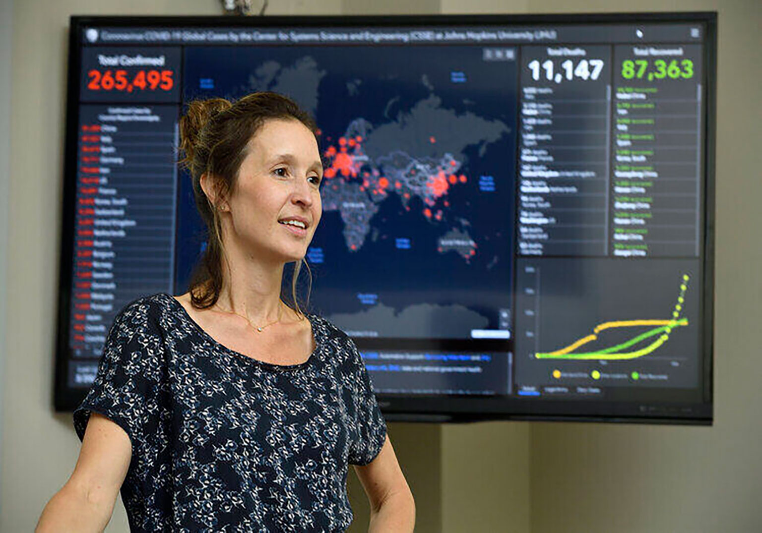
Lauren Gardner and her team built the popular Johns Hopkins University coronavirus dashboard in just a few hours. Credit: Will Kirk/Johns Hopkins University
Behind the Johns Hopkins University coronavirus dashboard
How a spur-of-the-moment decision went viral.
7 April 2020
In December when the disease that now is known as COVID-19 emerged in China, Ensheng Dong was studying the worrying spread of measles. A first-year graduate student in civil and systems engineering with a focus on disease epidemiology at Johns Hopkins University in Baltimore, Maryland, Dong began tracking the new disease. On 22 January, he and his thesis advisor in civil and systems engineering Lauren Gardner, who is co-director of the Center for Systems Science and Engineering (CSSE) at Hopkins, released an online “dashboard” documenting its spread.
That dashboard, like its subject, quickly went viral. It has become a familiar feature on news sites and on TV the world over, tracking the total number of confirmed COVID-19 cases, deaths, and recoveries globally. The site which Dong built in just a few hours receives more than a billion hits per day.
A unique real-time opportunity
Gardner’s team studies the way population behavior, such as mobility and other factors, influence disease risk. They build mathematical models to predict where disease hotspots are likely to arise. The sudden outbreak in Wuhan, China, of COVID-19, the disease caused by the coronavirus SARS-CoV2, provided “a unique opportunity to start building out a data set for an emerging infectious disease in real time,” she says.
Her team could use such data to build more accurate mathematical models of the disease’s likely spread. But realising other researchers could also benefit, the team decided to make the data more widely available.
“It was a bit of a spur-of-the-moment decision to say, let's build out this data set and let's keep doing it, let's make it public. And let's go ahead and visualize it while we're at it. And [we] built a dashboard that night.”
The intended audience, Gardner notes, was the research community -- other epidemiologists and disease modelers, for instance. But the whole world took notice. The map receives more than a billion interactions a day -- a number that includes both people visualizing the map and those who are mining the underlying data, Gardner says. The team had anticipated the numbers would be more in the order of hundreds or thousands. “I think both of us were just pretty surprised with the general public interest.”
According to Dong, the dashboard was easy to build in part because the team had already built something like it. Before COVID-19 broke out, Gardner and Dong had been looking for likely measles hotspots, using ArcGIS, a geospatial mapping tool from Esri, based in Redlands, California, to visualize their modeling results. That experience made it straightforward to build a dashboard for COVID-19.
Data come from a variety of sources including social media, the World Health Organization, the U.S. Centers for Disease Control and Prevention and the European Center for Disease Prevention and Control, the National Health Commission of the People’s Republic of China, and media and health departments around the world. Those data are collected, aggregated, and published to GitHub. From there, Dong says, they are pushed to Esri’s ArcGIS platform, which renders the dashboard and its visualizations.
Initially, those data were collected and input manually, first by Dong and then by students working round-the-clock in shifts. But as the disease spread, that quickly became unsustainable. So the team looked for ways to automate the process. Today, the dashboard is fed mostly using automated web-scraping and aggregation, updating nearly in real time. (So timely is the dashboard, in fact, that it often reports countries’ first cases before local health authorities do.)
The underlying dataset, stored on the code-sharing site GitHub, has been “starred” -- that is, favorited -- nearly 20,000 times, with nearly 1,700 submitted suggestions or bug reports and over 350 suggested data changes (“pull requests”). A paper describing the dashboard, published in The Lancet Infectious Diseases on 19 February, has already been cited 79 times, according to Google Scholar.

Will Kirk/Johns Hopkins University
Keeping up with all the suggestions, queries, and bug fixes, Gardner says, has been nearly impossible. “There's so many things that, if we had a hundred people that we could get just helping to pull this feedback together and do something with it, it would be great. But unfortunately a lot of it does slip through.”
This despite the fact that Gardner’s three-person team -- graduate student Hongru Du rounds out the group -- has swollen to nearly two-dozen, with help from other CSSE students, the university’s media and communications team, the Applied Physics Laboratory at Johns Hopkins, and Esri, the company upon whose mapping software the dashboard is built.
A core group of five does most of the work. “We'll all deserve a solid vacation when this thing calms down and people are allowed to socialize and travel again,” says Gardner. How many hours a day does she work? “All of them,” she deadpans.
The speed, scope and spread of the pandemic lent urgency to the team’s efforts. But so too has the dashboard’s popularity, Gardner says. Teams at APL and Esri, for instance, were brought on to keep the dashboard running in the face of a traffic onslaught. “They manage the service to make sure it doesn't crash, because it does when it gets a billion hits in hours, and it was clearly not built for that,” she says. “We've had to redesign that architecture a couple times, and upgrade those servers a few times.”
Also complicating matters were unexpected geopolitical challenges. As more and more countries became affected by the coronavirus, the team had to contend with the fact that place names sometimes differ depending on which governmental agency is doing the reporting. “There's obviously quite a few places in the world where not everybody in the world agrees on what they should be called,” she says. Following a “massive backlash”, the team ultimately adopted US State Department naming conventions. “Those kinds of things were really, really consuming and draining and distracting, but pretty serious issues,” she says.
Gardner says the dashboard has led to new collaborations, and provided increased exposure for both her team and her center. “I do expect it to bring really exciting opportunities to our group, and it already has,” she says. For example, with funding from the US National Aeronautics and Space Administration, the team will also study the impact of “seasonality and climate” on the virus.
Yet so far, working around the clock for 10 weeks straight, they’ve been so consumed with dashboard maintenance that they’ve had little time to analyze the data it actually shows.
“This last week has been the first time we've spent a week doing more math than data collection, and it was way more fun than anything we've done in a while,” she says. Other variables that could put the data into perspective, such as rates of mortality and testing, have had to wait, though those features should be live in the next week, Gardner says. The team is now focusing on “risk-assessment” modeling of the disease across the US, and what drives virus spread worldwide.
Nor has Gardner had time to reflect on the pandemic itself. “I think I'm the one person still walking around in this world that doesn't realize this crazy situation that we're in at an emotional and personal level,” she says, adding: “I’ve been so distracted that I'm gonna have a bit of a delayed processing of this actual situation after things slow down a little bit.”
Dong, who has family in China and friends in Wuhan, has been paying particularly close attention. “I worry about all of them,” he says.
Gardner stresses he is just a first-year graduate student. “I keep having to tell him, this is not normal,” she says. “He needs to prepare for a really boring second to fifth years.”