Credit: erhui1979/Getty
How to spot dubious claims in scientific papers
Statistics are easily manipulated. Here are four red flags.
8 September 2020

erhui1979/Getty
Far-fetched correlations, skewed data, and axis manipulation are some of the most common forms of trickery used in scientific publications and commentary.
In their new book, Calling Bullshit: The Art of Scepticism in a Data-Driven World, biologist Carl Bergstrom and data scientist Jevin West share their advice for how to spot misleading statistics in scientific papers, news articles, advertising, and social media posts.
“Numbers are ideal vehicles for promulgating bullshit,” say West and Bergstrom. “They feel objective, but are easily manipulated to tell whatever story one desires.”
Below are four of the statistical tricks they identify in scientific papers:
1. Flawed data
Papers that are thick with jargon, obscure techniques, and specialised equipment can be difficult to assess. Instead of trying to make sense of those elements, West and Bergstrom recommend going straight to the data.
“One can obtain stupid results from bad data without any statistical trickery,” they write. “This is often how bullshit arguments are created.”
For example, in a 2016 preprint posted on arXiv, computer scientists claimed that a new machine learning algorithm could predict criminality based solely on facial features, and with almost 90% accuracy.
Many news outlets ran with the story, but a quick look at the headshots used to ‘train’ the algorithm revealed a major flaw in the study’s design and conclusions. Most of the criminals were frowning in their headshots, while the non-criminals were faintly smiling, suggesting that the algorithm simply learned to detect differences in facial expression.
“We didn’t have to look at the details of the machine learning algorithms at all, because the problem didn’t arise there,” West and Bergstrom write. “As is often the case, one does not need technical expertise in machine learning to call bullshit.”
Red flag: No matter how technical a paper is, if the methods or conclusions don’t pass a common-sense check, it could have serious flaws.
2. Data censoring
A type of selection bias, data censoring is the deliberate or careless exclusion of certain data in the final analysis, which can lead to skewed and misleading findings.
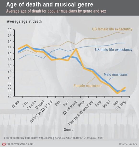
For example, a 2016 study on the life expectancies of musicians concluded that rap and hip-hop artists are more likely to die young than blues, jazz, and country artists. The findings were based on the mortality records of 13,195 musicians who died between 1940 and 2014.

Kenny et al.
West and Bergstrom say that the authors’ decision to exclude musicians who were still alive by the end of the study period skewed the findings, because it gave the impression that artists in more recent music genres (punk, rap, and hip hop) are more likely to die before turning 40 than those in older genres (blues and jazz).
“It’s not that rap stars will likely die young; it’s that the rap stars who have died must have died young, because rap hasn’t been around long enough for it to be otherwise,” they argue.
Red flag: If key data have been omitted, it can invalidate the conclusions of a study. When looking at a dataset, it’s important to focus on what it isn’t showing, say West and Bergstrom.
3. Spurious correlations
Rather than revealing a real relationship between two variables, spurious correlations can occur by chance when researchers engage in a practice called data dredging – trawling massive datasets to uncover possible associations and patterns.
It’s important to be wary of this when looking at large studies that survey participants on several factors at once, such as personality traits, physical characteristics, and education, say West and Bergstrom.
While some spurious correlations can be convincing, such as the relationship between vitamin D levels and COVID-19 infections, others can be plain absurd.
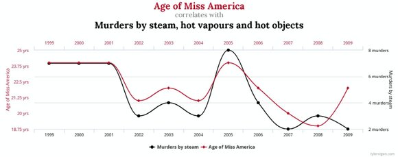
The graph below, created by Tyler Vigen, author of the book Spurious Correlations, shows a strong relationship between the age of Miss America and the number of murders by steam, hot vapours, and hot objects.

Tyler Vigen
Despite appearing to correlate on the graph, these trends are not related.
Red flag: If a correlation study does not control for other factors that could explain the results, there’s a good chance that the relationship between the two variables is not what it seems.
4. Axis manipulation
Data visualizations can be powerful tools for communicating results, but they can quickly become misleading with a few tweaks to the axis values.
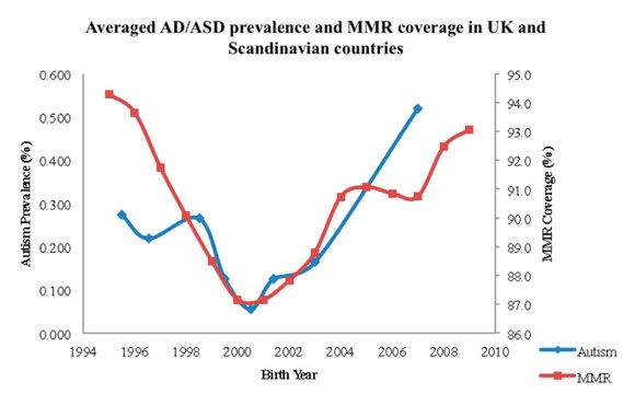
For instance, a 2015 study in the journal Issues in Law & Medicine used a line graph to demonstrate the link between the measles-mumps-rubella (MMR) vaccine and autism, a finding that has long been debunked.

Deisher et al.
At first glance, the trends appear to be closely related. But this is due to the major differences in the scales on each axis, rather than an actual relationship.
While autism prevalence (left axis) ranges from 0 to 0.6%, MMR coverage (right axis) is plotted from 86% to 96%. In reality, autism was roughly twice as prevalent by 2007, while MMR coverage had largely remained steady.
“By selectively changing the scale of the axes relative to each other, designers can make the data tell almost any story they want,” say West and Bergstrom.
Red flag: Visualizations that display an alarming or surprising result demand a higher degree of scepticism. They’re also more likely to be shared on social media, so it’s important to point out flaws when you see them.
