
Abstract
The accurate representation of data is essential in science communication. However, colour maps that visually distort data through uneven colour gradients or are unreadable to those with colour-vision deficiency remain prevalent in science. These include, but are not limited to, rainbow-like and red–green colour maps. Here, we present a simple guide for the scientific use of colour. We show how scientifically derived colour maps report true data variations, reduce complexity, and are accessible for people with colour-vision deficiencies. We highlight ways for the scientific community to identify and prevent the misuse of colour in science, and call for a proactive step away from colour misuse among the community, publishers, and the press.
Introduction
Vision is one of the most fundamental means of communication. It is (or should be) in every scientist’s best intention to make figures and their content as accurate and easily understandable as possible. One of the most powerful aspects of images is colour, which in turn transforms information into meaning. The visual evaluation of a colour gradient is important to a variety of different fields such as the first direct impression of a black hole1, the mapping of votes cast in political elections2,3, the planning of an expensive rover route on Martian topography4, the essential communication of climate change5,6, or the critical diagnosis of heart disease7. However, when colours are used incorrectly, this can lead to the effective manipulation of data (e.g., by highlighting some data over others), the oversight of the needs of those with colour vision deficiencies, and the removal of meaning when printed in black and white (Supplementary Note 1).
As science has become more prevalent in mainstream culture, it is not only the scientific community that suffers due to the use of poor colour choices, but also the wider public. Colour maps, therefore, are a crucial intersection between science and society. For instance, weather forecasts and hazard maps are two examples of immediately societal-relevant data sets that are also repeat offenders for use of the rainbow-like colour maps. Given the (daily) importance of these scientific topics, the underlying data should be conveyed in a universal manner. However, the colour-vision deficient fraction of the population is excluded and therefore unable to process this critical information. Furthermore, zones of danger, such as the boundaries of a hurricane track or current virus spread, are often based on uneven colour gradients to accentuate their importance. Using an uneven colour gradient is not an action without consequences, including those with significant financial or life-threatening consequences. Decisions based on data being ‘unfairly’ represented could produce, for instance, a Martian rover being sent over terrain that is too steep as the topography was inaccurately visualised, or a medical worker making an incomplete or inaccurate diagnosis based on uneven colour gradients.
Although some scientific communities have largely moved away from using distorting colour maps, such as rainbow, there are numerous signs of bad habits returning en masse8. Unfortunately, the previous efforts within specific disciplines to discredit rainbow-like maps appear to have not trickled through to all scientific leaders, publishers, and software designers. For most scientists, the choice of colour maps has become almost passive, with the unscientific rainbow-like colour palette being commonplace. Similarly, colour maps that pair red–green are also problematic, but remain widely used. At one point, most of the common software programmes applied rainbow as their default palette (e.g., MatLab, Paraview, VisAd, IrisExplorer) despite issues surrounding colour maps like rainbow, and variations thereof, being known for some time9,10,11,12,13,14,15,16,17,18,19,20.
So, what’s the problem with these colour maps? Even though rainbow colour maps might reflect aesthetic attractiveness, the extreme values in the standard Red-Green-Blue (RGB) are very dominant and can, therefore, distract from the underlying visual message21. In rainbow colour maps, the yellow is the brightest colour and attracts the eye the most22,23 (see Box 1), but it is neither at the end nor the centre of the colour map, while its greenish shades form a wide band with low perceived colour contrast (Supplementary Fig. 1). Hence, such an arrangement of colours can unfairly highlight a particular section of the parameter space while obscuring other parts (Fig. 1). Building a colour map on a purely physical rather than a perceptual basis significantly alters how we perceive data; it adds artificial boundaries to some parts of the data range, hiding small-scale variations elsewhere, it prevents any visual intuitive order occurring in the data set, and renders the data unreadable for readers with common colour-vision deficiencies (Fig. 2).
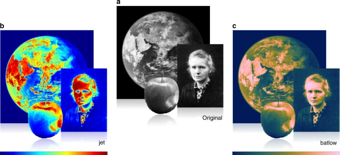
By knowing what something looks like in advance, the distortion by unscientific colour maps, like jet or rainbow, becomes instantly obvious. The look of scientific data is, however, usually unknown a priori, which makes the distortion of an unscientific colour map, and the true data representation of a scientifically derived colour map, like batlow41, less apparent. Marie Skłodowska-Curie, as originally photographed by Henri Manuel around 1920, the Earth from space, and an apple are shown a in their original images and b in distorted and c in undistorted colour versions. Inferring the true picture from an unscientifically (e.g., jet) coloured data set is incomparably harder than from a data set represented in a perceptually uniform and ordered colour map, like batlow41.
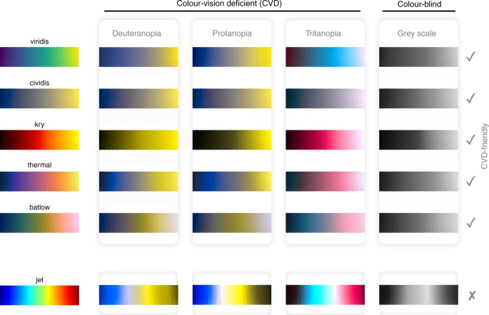
Available perceptually uniform colour maps versus the non-uniform rainbow (i.e., jet; bottom row) as seen with either of the three common forms of human colour-vision deficiency (deuteranopia, protanopia, and tritanopia), and for grey-scale (representing total colour-blindness or simple black-and-white prints). Rainbow, the most-widely used colour map, fails to reproduce a meaningful smooth gradient, yet the other colour maps (see Box 2) are all universally readable.
Colour maps that include both red and green colours with similar lightness cannot be read by a large fraction of the readership (Fig. 2). The general estimate is that worldwide 0.5% of women and 8% of men are subject to a colour-vision deficiency (CVD; e.g., refs. 24,25, and references therein). While these numbers are lower and almost disappear in populations from sub-Saharan Africa, they are likely significantly higher in populations with a larger fraction of white (Caucasian) people as, for example, in Scandinavia26. It is needless to state that scientific results should be accessible to as many people as possible. CVD-friendliness is, therefore, an aspect that should be important to all researchers, as well as publishers18,27,28.
For the casual reader, it might appear curious that the community of scientists, a group of people who are usually more critically inclined, fail to condemn the proliferation among themselves of rainbow and other, similarly unfit, colour maps. Based on this prevalence of unscientific colour maps, a basic understanding of their nature (Supplementary Fig. 2) and their dynamics seems to be missing in the academic community. Colour map choice is often made passively and is not subject to the same scrutiny as other data methodologies. Rainbow’s eye-grabbing nature, ease of use, and the inertia of both software products and scientific group leaders, allows the scientific community to remain attached to this unscientific colour map29. As a result, pointing out colour map flaws to the science community through scientific peer-review remains a challenging task, as requests or suggestions to change the colour palette are often met with rebuttal, misunderstanding, or are simply ignored.
Here, we highlight the importance of the scientific use of colour in data visualisation. We summarise methods to generate colour maps that deliver equal colour gradients all along the colour axis, to prevent data distortion. Various types of scientifically derived colour maps are readily and freely available (Box 2), and are the only way to intuitively and inclusively represent data without any blind interpretation. We outline key guidelines for choosing scientific colour maps that most accurately represent your data, and highlight how to spot common unscientific colour maps so they can be avoided. Finally, we call for a universal switch by the science community to adopt scientifically derived colour maps. Individuals, publishers and press should take a proactive approach to spot unscientific use of colour and so prevent the dissemination of visually distorted data.

The importance of colour to prevent data distortion
Scientific data should be displayed without the addition of visually artificial features or subtraction of real details, while also being universally readable and intuitive. A perceptually uniform colour map weights the same data variation equally all across the dataspace, while other colour maps (such as rainbow) interpret some small data variation to be more important than others (Fig. 3). For such unscientific, perceptually non-uniform colour maps (like rainbow), the interpretation is performed blindly (i.e., by the colour map instead of by the author) as the author or reader is not aware of the exact visual distortion that is introduced by the colour map (Fig. 3). Any scientific study drawing conclusions from a given set of data is, therefore, strongly dependent on the perceptual uniformity of the colour palette applied and, with it, author and reader become captive to a blind interpretation (for various examples, see Supplementary Note 1). Such a colour-introduced blind interpretation can diverge from an objective representation by more than seven percent of the displayed data variation30 (Fig. 3e–f). A flat slope on Mars can become visually distorted by the most prominent local gradients in colour rather than data, and then appears like rough terrain, while rough terrain conversely might be interpreted as a flat slope (compare Supplementary Fig. 7a, b), which is suboptimal with regards to a Martian exploration.

a, b The incremental lightness difference, ΔE, here using the CIEDE2000 formulation (see ‘Methods’), is a measure for the perceptual colour difference along the colour map. For a perceptually uniform colour map, ΔECIEDE2000 should be equal all along the colour map (i.e., a flat graph; a). Using c, d the cumulative colour lightness difference, ΔECumulative, it is possible to extract e, f the resulting visual error in percentage of total data variation. For scientifically derived colour maps like batlow41, the resulting error introduced to the data by the colouring is negligibly small as g the incremental data variation is represented equally all along the axis, and a linear data gradient, therefore, appears linear. Put differently, i a flat line looks flat. For non-scientific colour maps, like jet, h data gradients are unevenly represented and f visual error can be >7% of the displayed data variation such that j a linear graph (e.g., a flat line), for example, becomes unrecognisable.
Scientifically derived colour maps are perceptually uniform. This means the same data variation is weighted equally across the dataspace, and so the true data variation is accurately represented without unnecessary visual error (Fig. 3a, c, e, g, i). Just like a spatial x-, y-, or z-axis needs to have equal spacing between all axis tick marks (Fig. 3g, h), a colour axis (commonly termed colour bar; Supplementary Fig. 1) needs to have equidistant colour gradients. In other words, a certain data variation (e.g., a 5 °C temperature drop) should appear the same no matter whether it occurs at low temperatures (–10 °C) or high temperatures (30 °C).
Design and implementation of scientifically derived colour maps
While understanding the importance of perceptually uniform colour maps is simple, creating them can be complicated. Quantifying perceptual colour gradients is challenging because the complex nature of the human eye and brain has to be considered (Box 1). However, extensive research has been conducted to understand and provide guidelines for an optimal colour map design (see description in ‘Methods’ and refs. 18,19,20,29,31,32,33,34,35), and today, various freely available tools exist to create perceptually uniform colour palettes. In Box 2, we have compiled freely available scientific colour map toolkits, and described the benefits and limitations of each toolkit, to aid users in designing and/or selecting the most appropriate and accurate colour map for their data.
Perceptual uniformity is a crucial property for colour maps used in science, but by no means the only property to care about. Perceptual colour order is another important aspect in scientific colour map design, as it ensures the colour gradient is easily and intuitively understandable and allows qualitative understanding of a data set (Fig. 4). To achieve perceptual order, both lightness and brightness should increase linearly to avoid the perception of artificial gradients and to easily discern and compare significant values. The heated black-body radiation palette, for which the colours can be easily ordered from black-red-orange-yellow (or vice versa), is one example. Perceptual order is, therefore, a great asset to a colour map by emphasising gradients and pattern(s) in data. Moreover yet, colour maps specifically created for certain data sets (e.g., ref. 36) by no means guarantee their perceptual uniformity. Perceptual uniformity and intuitive colour order are both needed to prevent bias percolating into colour maps. This is also the case for so-called ‘improved’ rainbow-like maps such as Google’s Turbo37. Although Turbo appears to meet perceptual order, the perceptual uniformity requirement of a science-ready colour map is not met due to its non-uniform lightness spectra.

A constant incremental colour and lightness contrast along a colour map is a proxy for its perceptual uniformity. a While a certain incremental data variation is either under- or strongly overrepresented with jet (a.k.a. rainbow) depending on the colour map segment, it is instead b evenly represented all along a colour bar when using a scientific colour map like batlow41, due to its uniform colour and lightness contrast. Perceptual order is given when individual colours of a colour map can be sequentially ordered effortlessly without consulting the colour bar. While c a sequential ordering is not intuitively possible for jet (a.k.a. rainbow), it is d possible to sequentially order individual colours of a scientifically derived colour map like batlow41, thanks to its constant lightness gradient.
In addition, colour maps should be universally readable, and they can be mathematically optimised to account for colour-vision deficiency using modern colour appearance models38 (Fig. 2 and Box 1). As well as making colour palettes readable for readers with variable vision capabilities, it is also advantageous to make them readable for completely colour-blind readers. In contrast to other colour palettes, a colour map for scientific use should feature a uniform gradient across the whole colour axis. With an even, monotonic lightness gradient (Supplementary Fig. 1a), a colour palette remains readable (as well as perceptually uniform and ordered) even after a conversion to grey scale, assuming no complicated grey-scale filter is used.
To achieve the best possible data representation, colour palettes need to effectively convey the underlying data and its nature. This can be achieved by choosing the most appropriate colour map class and type (Fig. 5 and outlined in detail in Supplementary Notes 2 and 3). If the data is divergent about a central value (e.g., centred about zero), a divergent or a multi-sequential colour map should be chosen that clearly and intuitively distinguishes either side of the axis (Fig. 5, and Fig. 6 for a detailed user guide).

The various classes of colour maps (sequential; diverging; multi-sequential; cyclic) and types (continuous; discrete; categorical). Only sequential colour maps can be faithfully applied to categorical types of data.
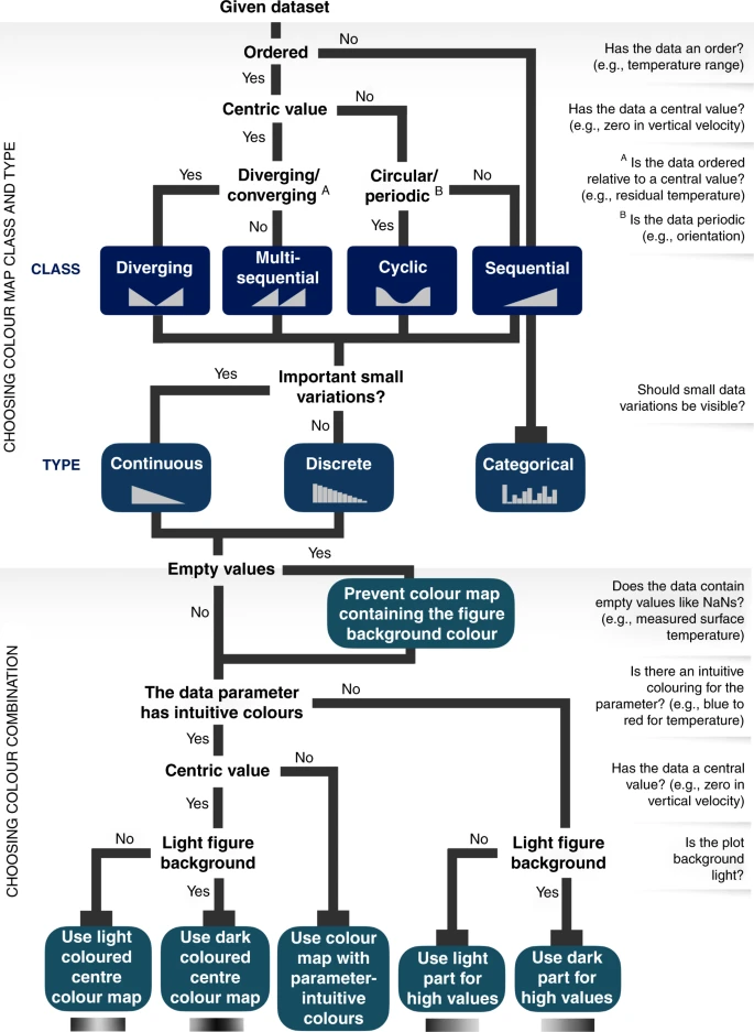
For effective data representation, the nature of a given data set has to be matched by a suitable colour map class, type, and colour combination.
An intuitive colour gradient becomes imperative if data are displayed without the provision of the colour bar (the axis relating colours to data values). Unfortunately, missing colour bars are more common than most would expect, as scales are sometimes cropped out or omitted during reproduction or subsequent dissemination (e.g., refs. 1,4,39). It is imperative to ensure the colour bar is included on all figures where a colour scale is used, as even the most intuitive colour map could be rendered useless with no colour bar for the reader to refer to. Excluding a colour bar would be equivalent to not including the axis labels and tick marks on the x- or y-axis of a plot. Additionally, attention has to be paid to the lightness (i.e., light or dark) of the background on which the colours are displayed. Background creates contrast, in lightness and colour, to the displayed data (Supplementary Fig. 3 and Supplementary Movie 1).
To optimise the use of the currently available perceptually uniform colour maps listed in Box 2, there are certain requirements to prevent them from becoming distorted (e.g., ref. 30). As the colour bar has to be handled similarly to the position axis, parts of a scientifically derived colour map cannot be subsequently deformed by being partly squeezed or elongated. If the spacing between a position axis’ ticks were squeezed or elongated, it would visually distort the data in the figure. Simply put, a linear graph would no longer appear linear (Fig. 3h, j). Therefore, altering any available scientifically derived colour map is not recommended. Additionally, avoiding certain types of graphs and plots is important to not alter the local perception of individual colours. Common heatmaps with directly connected colour tiles, as opposed to tiles with gaps in between, can alter individual colours significantly40 (Supplementary Fig. 3).
How to recognise an unscientific colour map
It is the responsibility of individuals, publishers, and the press to prevent the dissemination of visually distorted data and to take a proactive approach in spotting the unscientific use of colour. There are straightforward checks to recognise the unscientific use of colour that are handy for users, readers, reviewers and editors:
-
1.
The colour bar should be perceptually uniform to prevent data distortion and visual error. This means the perceptual colour differences between all neighbouring colours should appear the same. If two neighbouring colours have a different variation compared to other neighbouring colours (e.g., two greenish versus two yellowish-reddish colours in rainbow colour maps), the colour bar is perceptually non-uniform and not scientific (as shown in Fig. 4).
-
2.
The colour map should not contain red and green at a similar luminosity (Box 1 for definitions). If this is the case, it can be assumed that these two colours cannot be distinguished by a large fraction of the readership and, therefore, fails as a scientific way of displaying data.
-
3.
The common rainbow colour map should not be used in data visualisation. There is not a single rainbow colour map with similarly bright colours across the colour bar that comes close to being scientific (e.g., ref. 32).
-
4.
The most secure test is to discard any colour map that is not described as scientifically derived (for example, is not listed in Box 2), as it should be both perceptually uniform and CVD friendly.
A proactive step forward for the science community
It is important to maintain the progress that has already been made across the scientific community (in particular in the fields of Earth, Space, and Climate science). Recently, a number of significant scientific achievements have been based upon non-distorting and universally readable scientifically derived colour maps, such as the first ever observation-based visualisation of a black hole1, for which a lajolla-like colour map41 was used, and the effective visualisation of climate change on a local, regional, and global level39, which applied a vik-like colour map41. However, there are danger signs that this progress could be lost. Unscientific colour maps are still often set as the default in software packages, which in turn also renders them a prevalent choice among many academic group leaders. Furthermore, unscientific colour maps are still accepted and published by academic journals. This combination leads users, students, and readers into believing that these choices are based on informed decisions, and that there are no fundamental issues with unscientific colour maps. Given this current landscape, it is an instructive reminder that new generations of scientists have to be made aware of the importance of scientifically derived colour maps and the pitfalls of those that are not.
Transferring the knowledge and awareness about the importance of scientifically derived colour maps to new generations of scientists is, therefore, a key goal. Teaching is a frontline tool in building solid visualisation skills. Indeed, learning and applying scientific data visualisation should be a requirement to receive BSc, MSc, and PhD degrees. Here, we provide an instructive user guide for choosing and applying a suitable scientific colour map (Fig. 6), which should be part of every research office, and possibly even desk space. We provide a poster (Supplementary Data 1) that can be placed in communal areas, like near a printing station, coffee machine or restroom, that highlights the key advantages of scientifically derived colour maps and serves as a conversation starter.
Recommendations to colleagues via peer-review is another critical tool to ensure the quality of our ongoing scientific visual communication. While editors could certainly provide guiding recommendations, it is also critical that scientifically derived colour maps are being applied already during the early diagnosis of the data, and not just applied for publication only. Set instructions by scientific journals or conference organisers could remind researchers to fulfil the graphical standards that science needs to be built upon. It might even be useful to limit researchers to using only a handful of hand-picked, suitable colour maps for specific types of data and data parameters to streamline and enhance data visualisation. This type of approach is being developed for the next assessment reports of the Intergovernmental Panel on Climate Change (IPCC), in collaboration with Melissa Gomis (Graphics and Science Communication officer, IPCC WGI Technical Support Unit, Université Paris-Saclay, France).
Presently, scientifically derived colour maps are easily accessible and applicable across various tools and platforms and suitable palettes exist for any given data (Box 2). The open availability of such colour maps ultimately leaves little legitimate room to continue using colour maps that cause visual distortion, are unreadable in some circumstances, or exclude readers from understanding them.
The wider scientific community needs to accept that colour maps are a pivotal tool in scientific discovery, data visualisation and science communication. Non-scientific colour maps require scrutiny and rejection from the community to preserve academic integrity. The evidence is clear, there are no more reasons to continue using unscientific colour maps.
Methods
Defining colour spaces
Various methods and tools based on different metrics and colour spaces (Supplementary Note 4) exist to diagnose the uniformity of a colour palette (e.g., refs. 32,34,38). A widely used example is the International Commission on Illumination’s uniform colour space named CIELAB UCS42,43,44. CIELAB UCS (also abbreviated from Uniform/Unified Colour Scale, Chromaticity Scale, Chromaticity Space) describes the complete range of colours in a perceptually uniform rectangular coordinate system45 and allows the creation of perceptually uniform colour palettes32,35,46,47.
The colour appearance model CIECAM0248,49, and the perceptually uniform colour space CIECAM02-UCS50 based on it, is the current gold standard to describe how we perceive colour and colour differences. CIECAM02-UCS describes a certain colour by its lightness (L) and its red–green (a) and yellow-blue (b) correlates (Supplementary Figs. 4 and 5), and it represents a certain perceptual colour variation on equal Euclidean distances across the whole space. Colour spaces like CIECAM02-UCS make it possible to design perceptually uniform colour maps and, also, to take colour-deficient vision into account.
Here, the CIELAB UCS colour difference metric ΔECIEDE 200051 is used (Fig. 3a, b) and allows the calculation of a local lightness gradient between two colours by
where L is the lightness of one specific colour, and a its red–green and b its yellow-blue correlative (Supplementary Figs. 4 and 5). This lightness difference metric can be used to diagnose any colour map (e.g., ref. 20) and calculate the effective, perceptual error that is added to the underlying data by uneven colour gradients along a colour map30. These errors and the resulting visual data distortion can be significant and make, for example, linear data gradients look like a wobbly graph (Fig. 3).
Data availability
The scientific colour maps are openly available from ref. 41 and archived on Zenodo52 (https://doi.org/10.5281/zenodo.1243862). All other additional information related to the article is provided in the Supplementary Information and Box 2.
References
Akiyama, K. et al. First M87 event horizon telescope results. IV. Imaging the central supermassive black hole. Astrophys. J. Lett. 875, L4 (2019).
Long, E. Election Data Visualisation (University of Plymouth, 2013).
Cox, A., Bostock, M., Watkins, D. & Shan, C. The Most Detailed Maps You’ll See from the Midterm Elections., https://www.nytimes.com/interactive/2014/11/04/upshot/senate-maps.html (2014).
Lemoine, F. G. et al. An improved solution of the gravity field of Mars (GMM-2B) from Mars Global Surveyor. J. Geophys. Res.: Planets 106, 23359–23376 (2001).
Hawkins, E. Scrap rainbow colour scales. Nature 519, 291 EP (2015).
IPCC. Global Warming of 1.5° C: An IPCC Special Report on the Impacts of Global Warming of 1.5° C Above Pre-industrial Levels and Related Global Greenhouse Gas Emission Pathways, in the Context of Strengthening the Global Response to the Threat of Climate Change, Sustainable Development, and Efforts to Eradicate Poverty. (Intergovernmental Panel on Climate Change, 2018).
Borkin, M. et al. Evaluation of artery visualizations for heart disease diagnosis. IEEE Trans. Vis. Computer Graph. 17, 2479–2488 (2011).
McNeall, D. How many Rainbows at EGU 2018, <https://betterfigures.org/2018/04/16/how-many-rainbows-at-egu-2018> (2020).
Bertin, J. Graphics and Graphic Information Processing. (Walter de Gruyter, 2011).
Bertin, J. Semiology of graphics; diagrams networks maps. (University of Wisconsin, Press, Madison, 1983).
Tufte, E. R. Envisioning Information. Vol. 126 (Graphics Press, 1990).
Travis, D. Effective Color Displays: Theory and Practice. Vol. 1991 (Academic press London, 1991).
Brewer, C. A. Color use guidelines for mapping. Vis. Mod. Cartogr. 1994, 123–148 (1994).
MacEachren, A. M. How Maps Work: Representation, Visualization, and Design. (Guilford Press, 2004).
Dent, B. D., Torguson, J. S. & Hodler, T. W. Cartography: Thematic Map Design. Vol. 5 (WCB/McGraw-Hill New York, 1999).
Robinson, A. Elements of Cartography. (John Wiley and Sons, New York, 1960).
Monmonier, M. How to Lie with Maps (University of Chicago Press, 2018).
Light, A. & Bartlein, P. J. The end of the rainbow? Color schemes for improved data graphics. Eos Trans. AGU 85, 385–391 (2004).
Stauffer, R., Mayr, G. J., Dabernig, M. & Zeileis, A. Somewhere over the rainbow: how to make effective use of colors in meteorological visualizations. Bull. Am. Meteorological Soc. 96, 203–216 (2015).
Thyng, K. M., Greene, C. A., Hetland, R. D., Zimmerle, H. M. & DiMarco, S. F. True colors of oceanography: guidelines for effective and accurate colormap selection. Oceanography 29, 9–13 (2016). Introducing the scientifically derived cmocean colour maps for better data visualisation in oceanography that also underline the importance of intuitive colour palettes given a certain data parameter.
Cairo, A. The Functional Art: An Introduction to Information Graphics and Visualization. (New Riders, 2012).
Wolfe, J. M. & Horowitz, T. S. Five factors that guide attention in visual search. Nat. Hum. Behav. 1, 0058 (2017).
Alexander, K. R. & Shansky, M. S. Influence of hue, value, and chroma on the perceived heaviness of colors. Percept. Psychophys. 19, 72–74 (1976).
Sharpe, L. T., Stockman, A., Jägle, H. & Nathans, J. Opsin Genes, Cone Photopigments, Color Vision, and Color Blindness. Vol. 351 (Cambridge University Press, 1999).
Neitz, J. & Neitz, M. The genetics of normal and defective color vision. Vis. Res. 51, 633–651 (2011).
Drummond-Borg, M., Deeb, S. S. & Motulsky, A. G. Molecular patterns of X chromosome-linked color vision genes among 134 men of European ancestry. Proc. Natl Acad. Sci. 86, 983–987 (1989).
Albrecht, M. Color blindness. Nat. Methods 7, 775 EP (2010).
Wong, B. Reply to \“More on color blindness\“. Nat. Methods 8, 891 EP (2011).
Moreland, K. Why we use bad color maps and what you can do about it. Electron. Imaging 2016, 1–6 (2016). The widespread use of the rainbow is the main reason scientists propagate it further, which must therefore be considered if a scientific alternative is to be effective.
Crameri, F. Geodynamic diagnostics, scientific visualisation and StagLab 3.0. Geoscientific Model Dev. 11, 2541–2562 (2018).
Silva, S., Sousa Santos, B. & Madeira, J. Using color in visualization: a survey. Computer Graph. 35, 320–333 (2011).
Kovesi, P. Good colour maps: how to design them. CoRR abs/1509.03700 (2015). Provides a set of colour map diagnostics and shows that the most important factor designing a colour map is perceptually uniform lightness, allowing to construct more consistent and reliable ternary base colours to replace the problematic RGB primaries red, green, and blue.
Szafir, D. A. Modeling color difference for visualization design. IEEE Trans. Vis. Computer Graph. 24, 392–401 (2018).
Bujack, R. et al. The Good, the bad, and the ugly: a theoretical framework for the assessment of continuous colormaps. IEEE Trans. Vis. Computer Graph. 24, 923–933 (2018).
Ware, C. et al. Measuring and modeling the feature detection threshold functions of colormaps. IEEE Trans. Vis. Computer Graph. 25, 2777–2790 (2019).
Zeller, S. & Rogers, D. Visualizing science: How color determines what we see. Eos Trans. AGU Vol. 101 (American Geophysical Union, 2020). https://doi.org/10.1029/2020EO144330
Mikhailov, A. in Google AI Blog Vol. 2020 (Google, https://ai.googleblog.com/2019/08/turbo-improved-rainbow-colormap-for.html, 2019).
Nuñez, J. R., Anderton, C. R. & Renslow, R. S. Optimizing colormaps with consideration for color vision deficiency to enable accurate interpretation of scientific data. PLoS ONE 13, e0199239 (2018). Developed the mathematically optimal colour map for readers with different colour-vision deficiencies named Cividis, which allows most accurate perception of data by as many viewers as possible.
Hawkins, E. (http://www.climate-lab-book.ac.uk/2018/2018-visualisation-update/, 2019).
Wong, B. Color coding. Nat. Methods 7, 573 EP (2010).
Crameri, F. Scientific Colour Maps, http://www.fabiocrameri.ch/colourmaps (2020).
Smith, T. & Guild, J. The CIE colorimetric standards and their use. Trans. Optical Soc. 33, 73 (1931).
C. I. E. Technical Report Colorimetry. (Commission Internationale de l’Eclairage Central Bureau Vienna, Austria, 2004).
CIE. Part 4: CIE 1976 L* a* b* Colour space, http://www.cie.co.at/publications/colorimetry-part-4-cie-1976-lab-colour-space (2011).
Hunter Associates Laboratory Inc. Brief Explanation of Delta E or Delta E*,http://support.hunterlab.com/hc/en-us/articles/%20203023559-Brief-Explanation-of-delta-E-or-delta-E-> (2019).
Meier, B. J., Spalter, A. M. & Karelitz, D. B. Interactive color palette tools. IEEE Computer Graph. Appl. 24, 64–72 (2004).
Moreland, K. in Advances in Visual Computing (eds George Bebis et al.) 92–103 (Springer Berlin Heidelberg, Berlin, Heidelberg, 2009).
Moroney, N. et al. in Color and Imaging Conference Vol. 2002 23–27 (2002).
International Commission on Illumination. Technical Committee TC 8-01. in Colour Appearance Modeling for Colour Management Systems (2004).
Luo, M. R., Cui, G. & Li, C. Uniform colour spaces based on CIECAM02 colour appearance model. Color Res. Appl. 31, 320–330 (2006).
Lindbloom, B. Delta E (CIE 1976). http://www.brucelindbloom.com/index.html?Eqn_DeltaE_CIE76.html (2019).
Crameri, F. Scientific colour maps: perceptually uniform and colour-vision deficiency friendly. Zenodo, https://doi.org/10.5281/zenodo.1243862 (2018).
Crameri, F. DiVA: effective design for any MatLab figure. Zenodo, https://doi.org/10.5281/zenodo.3596368 (2020).
Curcio, C. A. et al. Distribution and morphology of human cone photoreceptors stained with anti‐blue opsin. J. Comp. Neurol. 312, 610–624 (1991).
Meyer, G. W. & Greenberg, D. P. Color-defective vision and computer graphics displays. IEEE Computer Graph. Appl. 8, 28–40 (1988).
Lennie, P., Pokorny, J. & Smith, V. C. Luminance. J. Optical Soc. Am. A: Opt. Image Sci., Vis. 10, 1283–1293 (1993).
Kaiser, P. & Boynton, R. Human Color Vision. 2nd edn, (Optical Society of America, 1996).
Roorda, A., Metha, A. B., Lennie, P. & Williams, D. R. Packing arrangement of the three cone classes in primate retina. Vis. Res. 41, 1291–1306 (2001).
Lafer-Sousa, R., Hermann, K. L. & Conway, B. R. Striking individual differences in color perception uncovered by ‘the dress’ photograph. Curr. Biol. 25, R545–R546 (2015).
Emery, K. J. & Webster, M. A. Individual differences and their implications for color perception. Curr. Opin. Behav. Sci. 30, 28–33 (2019).
Brewer, C. A. Colorbrewer Colour Maps, https://colorbrewer2.org/ (2020).
van der Walt, S. & Smith, N. MPL Colour Maps, https://bids.github.io/colormap (2020).
Nuñez, J. R., Anderton, C. R. & Renslow, R. S. Cividis colour map, PLoS ONE, https://www.doi.org/10.1371/journal.pone.0199239.s002 (2020).
Thyng, K. M., Greene, C. A., Hetland, R. D., Zimmerle, H. M. & DiMarco, S. F. CMOcean Colour Maps, http://matplotlib.org/cmocean (2020).
Kovesi, P. CET Colour Maps, http://peterkovesi.com/projects/colourmaps (2020).
Acknowledgements
We thank Melissa Gomis for valuable feedback on the user guide and Stefan Scherrer for contributing the Supplementary Movie 1. The open-access figure design routine DiVA53 was used. F.C. and G.E.S. acknowledge support from the Research Council of Norway through its Centres of Excellence funding scheme, Project Number 223272. P.J.H. receives funding from the European Union’s Horizon 2020 research and innovation programme under the Marie Skłodowska-Curie Grant Agreement 749664.
Author information
Authors and Affiliations
Contributions
F.C. designed the Scientific colour maps and the figures, G.E.S. contributed to the development and software compatibility of the Scientific colour maps, P.J.H. designed the outreach poster. All authors conceived the study, evaluated the use of and promoted scientifically derived colour maps, and contributed to the scientific discussion and preparation of the manuscript.
Corresponding author
Ethics declarations
Competing interests
The authors declare no competing interests.
Additional information
Publisher’s note Springer Nature remains neutral with regard to jurisdictional claims in published maps and institutional affiliations.
Rights and permissions
Open Access This article is licensed under a Creative Commons Attribution 4.0 International License, which permits use, sharing, adaptation, distribution and reproduction in any medium or format, as long as you give appropriate credit to the original author(s) and the source, provide a link to the Creative Commons license, and indicate if changes were made. The images or other third party material in this article are included in the article’s Creative Commons license, unless indicated otherwise in a credit line to the material. If material is not included in the article’s Creative Commons license and your intended use is not permitted by statutory regulation or exceeds the permitted use, you will need to obtain permission directly from the copyright holder. To view a copy of this license, visit http://creativecommons.org/licenses/by/4.0/.
About this article

Cite this article
Crameri, F., Shephard, G.E. & Heron, P.J. The misuse of colour in science communication. Nat Commun 11, 5444 (2020). https://doi.org/10.1038/s41467-020-19160-7
Received:
Accepted:
Published:
DOI: https://doi.org/10.1038/s41467-020-19160-7
This article is cited by
-
Starvation resistance in the nematode Pristionchus pacificus requires a conserved supplementary nuclear receptor
Zoological Letters (2024)
-
Powder-size driven facile microstructure control in powder-fusion metal additive manufacturing processes
Nature Communications (2024)
-
Magmatism controls global oceanic transform fault topography
Nature Communications (2024)
-
Widespread fracture movements during a volcano-tectonic unrest: the Reykjanes Peninsula, Iceland, from 2019–2021 TerraSAR-X interferometry
Bulletin of Volcanology (2024)
-
Turbulence in the Strongly Heterogeneous Near-Surface Boundary Layer over Patchy Snow
Boundary-Layer Meteorology (2024)
Comments
By submitting a comment you agree to abide by our Terms and Community Guidelines. If you find something abusive or that does not comply with our terms or guidelines please flag it as inappropriate.
