
Abstract
Visual art has been used to revamp the portrayal of climate change with the aims of engaging emotions and expanding nonexperts’ psychological capacity to perceive its relevance. However, empirical evidence supporting the effectiveness of artistic representation of data as a tool for public communication is lacking. Using controlled experiments with two national samples of U.S. adults (total N = 671), here we found that artistic visualizations elicited stronger positive emotions than informationally equivalent data graphs but did not differ in their perceived credibility or effectiveness as visual aids for learning. When used to prompt individual reflection, artistic visualizations appeared to mitigate the political division in viewers’ perceived relevance of climate change that could otherwise be exacerbated by exposure to data graphs.
Introduction
Despite the passing of the Inflation Reduction Act, designed to curb greenhouse gas emissions, the U.S. public is still divided over how to address the challenges caused by climate change1. Opinion gaps have been widening between liberals and conservatives regarding the urgency to act and the policy direction(s) the country should take1. Many existing efforts attempt to mitigate the opinion gap by using data and scientific graphs to relay the reality of climate change2,3,4. Although data graphs confront viewers with imputable evidence, they may signal an intent of reasoning and heighten the skeptics’ biased processing of attitudinally incongruent information5,6. Numerous calls have been made to infuse data-based communication with emotions and portrayals of shared experiences to unite individuals who may otherwise disagree7.
In response, scientist and artists in the U.S. have revamped graphical representations of climate change with visual art. For instance, line graphs of soaring temperatures were incorporated into watercolor portrayals of mountains and glaciers, and a chart showing the trend in hurricane strength was transformed into abstract art with contrasting colors8,9. The assumption behind artworks like these is that they can help “meet the imaginative deficit of scientific data”, leading scientist-artists to disseminate the works via social media in hopes of raising public awareness10. The #ShowYourStripes campaign initiated by the UK climate scientist Ed Hawkins on social media, for example, allows residents in 179 U.S. cities and other places around the globe to transform local, century-long temperature data into a series of blue-to-red colored warming stripes. As seen on buildings, streets, scarfs, masks, and the cover of Greta Thunberg’s “The Climate Book”, the artistic visualization has become an iconic symbol that is widely used to encourage local climate action11.
However, as artistic representations of climate data proliferate, questions remain as to whether they are more effective than scientific data graphs in conveying factual evidence and boosting public trust in the accompanying information. Despite their prevalence, artistic visualizations can fail if their abstraction trumps clarity12. Viewers may beautify, trivialize, or even misinterpret the delineated issue when artistic portrayals make data obscure13. Those who lack interest or appreciation for visual art may feel particularly distanced or distracted by such a medium14,15.
Nonetheless, members of the scientific community commonly regard visual art as a beneficial tool for communicating their work16. As Nature found in a recent poll with its readers affiliated with various scientific disciplines (N = 350), almost all participants indicated they would consider collaborating with artists in public outreach efforts, believing that it would help “make emotional connections that enhance learning”17. Although studies have found that artistic visualizations can elicit strong emotions18,19,20, little evidence exists to show how they may help people retain knowledge better than data graphs as a more established visual language of science. It is also unclear if the use of artistic visualizations may diminish viewers’ perceived credibility of the accompanied information as many people may lack trust in artists when it comes to science12.
Using an online controlled experiment with a non-probability sample of U.S. adults (N = 319), this study examined how artistic representations of climate data, as compared to scientific graphs, might influence viewers’ emotions and recall of climate change information. We also investigated whether artistic representations of data were perceived as more or less credible than scientific graphs and studied how the art’s impact on emotions might vary as a function of one’s interest in visual art.
More importantly, we questioned if enhancing the data-based communication of climate change with visual art could help bridge the political divide on climate change. Liberal Democrats and conservative Republicans in the U.S. tend to interpret climate data through a political lens and use the provided data to justify their preexisting beliefs4. For example, an eye-tracking study found that when looking at a line graph featuring global temperature change, liberals paid more attention to the rising phase than the flat phase of the temperature curve while the opposite was true for conservatives21. However, liberals and conservatives did not differ in their attention when the graph was framed as unrelated to climate change21. As political motivations drive selective attention to graphical evidence, overreliance on data graphs for communicating climate change may exacerbate political division on this issue.
Artistic representations of data, nonetheless, can potentially attenuate the polarizing effect of data graphs by engaging certain emotions that mitigate motivated attention and reasoning. Specifically, avoidance emotions, such as anxiety, can “promote the consideration of opposing views and a willingness to compromise”, regardless of the accuracy of the presented view22,23. For example, when experiencing anxiety, partisans were more likely to accept corrections to politically congruent misinformation from the opposing party24. As with other forms of climate art, artistic representations of data can evoke anxiety or similar emotions by portraying the tangible reality of climate change18,25. Such emotional experiences may motivate spectators to reassess the visualized data that contradicts their beliefs and reduce the perceived distance to climate change26. Although some anecdotal evidence exists to suggest this possibility27,28, empirical evidence is lacking. We hence raised a research question asking if individuals would be less politically polarized in their perceived relevance of climate change when viewing artistic visualizations than when viewing informationally equivalent data graphs.
In addition, priming individuals with non-directional goals, such as to comprehend or achieve accuracy, can help them autonomously engage with the shown information instead of defaulting to biased reasoning29,30. For instance, when being asked to thoughtfully evaluate a piece of graphical evidence (e.g., a line graph indicating the loss of Arctic ice), conservatives were more likely to agree that climate change was serious than when reading an article unrelated to environmental issues4. In a similar vein, individuals judged art pieces to be “more powerful, challenging, and personally meaningful” when asked to write interpretations of them31. We wondered if offering reflective primes, such as prompting viewers to reflect on the meaning of and emotions evoked by the shown visuals, would interfere with the proposed depolarizing effect of artistic visualizations. In other words, do artistic visualizations still mitigate the polarizing effect that could otherwise be exacerbated by data graphs when viewers are prompted to ponder what they have seen and felt from the images? A follow-up experiment with a non-probability adult sample (N = 352) was conducted to answer this question.
The art piece chosen as the experimental stimulus was created by Diane Burko, an American painter and photographer who exhibited her climate-themed paintings at various venues, including the National Academy of Sciences, Engineering, and Medicine and the Bernstein Gallery at Princeton University. The piece, titled Summer Heat, 2020, was selected due to its exemplary integration of fine art and a recognizable scientific graph (Fig. 1). The embedded graph references the renowned Keeling curve, which shows the accumulation of carbon dioxide in the Earth’s atmosphere based on continuous measurements taken at the Mauna Loa Observatory since 195832. By having a simplified version of the Keeling curve juxtaposed with melted glaciers, the artwork conveys that “the causes and effects of climate change are crashing into each other”33. The red-colored map of Europe also reminds viewers of the record-breaking heat that hit the area in 2020.

a The original piece of “Summer heat, 2020”. b The edited art piece with the detailed Keeling curve graph. c The edited, simplified Keeling graph. d The detailed Keeling curve graph. The corresponding author obtained permission from artist Diane Burko to use and manipulate her artwork as experimental stimuli for this study.
Based on Burko’s art piece and the original Keeling curve, we created a 2 (artistic representation vs. data graph) * 2 (detailed graph vs. simplified graph) experimental design that allowed us to examine the effect of the visual format without being confounded by the distinct level of data specificity shown in the stimuli. For each condition, we first showed one stand-alone image (Fig. 1) to prompt reflections and gauge evoked emotions and then displayed one mockup Instagram post embedding the same image and a caption drafted by the authors (Fig. 2). With two billion active users, Instagram has expanded the collaborative space between art and science34, allowing scientist-artists to reach out to audiences that are less frequent visitors of science museums and art galleries35,36. The ecological validity of the stimuli would be enhanced by such a setup. We then measured information recall, perceived credibility, and perceived relevance of climate change after showing the mockup Instagram posts.

a Post with the original piece of “Summer heat, 2020”. b Post with the edited art piece with the detailed Keeling curve graph. c Post with the edited, simplified graph. d Post with the detailed Keeling curve graph.
The study found that artistic representations of data elicited stronger emotional responses than data graphs. Although participants with a lower level of art interest reported stronger negative emotions from data graphs, those with a higher level of art interest tended to perceive stronger negative emotions from the artistic visualizations. Interestingly, both data graphs and artistic visualizations were perceived as equally credible by participants. When primed to reflect on the meaning and emotions evoked by the visuals, participants were less politically polarized in their perceived relevance of climate change when viewing artistic visualizations than when viewing data graphs alone.
Results
Artistic representations of data evoked stronger positive emotions than data graphs
Participants were recruited in April 2022 through online panels provided by Forthright, a research panel available through Bovitz, Inc. Upon passing the inclusion criteria (i.e., having visited Instagram in the past) and offering consent to participate, participants were randomly assigned to four treatment groups and completed an online survey that lasted ~15 min. The study received approval from the University of Wisconsin-Madison Institutional Review Board (ID: 2022-0232).
The first goal was to examine the emotional impact of the artistic representation of data. Using a 5-point scale (1 = “none at all”, 3 = “a moderate amount”, 5 = “a great deal”), we asked a question including 12 items that were previously used to gauge emotional reactions to climate change art18. For positive emotions, the items included “happiness”, “a sense of awe”, “inspiration”, “enthusiasm”, and “hope”; the mean value was used as an index (Cronbach’s alpha = 0.89, mean 1.90, s.d. 0.97). For negative emotions, the items included “guilt”, “sadness”, “anger”, “anxiety”, “disappointment”, “uneasiness”, and “fear”. An index based on the mean value was created (Cronbach’s alpha = 0.93, mean 1.97, s.d. 1.02).
Results of the ANOVA (see Supplementary Table 1) and post hoc comparisons showed that artistic representations evoked stronger positive emotions than data graphs as the main effect of art was significant, F (1, 316) = 8.16, p = 0.005, η2 = 0.025. Further, the stimuli with detailed graphs elicited stronger negative emotions than the ones with simplified graphs as the main effect of detailed was significant, F (1, 316) = 13.21, p = 0.000, η2 = 0.04 (see Supplementary Table 2). In addition, the original art piece elicited the highest positive emotions (mean 2.17, s.d. 1.06), whereas the edited data graph (i.e., the one without any label, title, or numeric scale) elicited the lowest levels of positive emotions (mean 1.54, s.d. 0.82) and negative emotions (mean 1.59, s.d. 0.77) (Fig. 3).
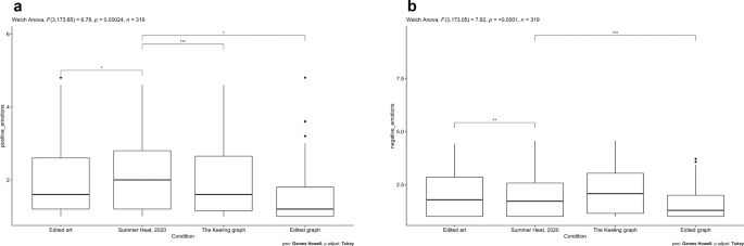
a Positive emotions. b Negative emotions. Sample size for the “Edited art” group is 82, for the “Summer Heat, 2020” group is 77, for the “The Keeling graph” group is 80, and for the “Edited graph” group is 80. These are box graphs indicative of the data outliers, upper limit, third quantile, median, first quantile, and lower limit. The stars (*) above the boxes show the significance level of the post hoc comparisons between group means (*p < 0.05, **p < 0.01, ***p < 0.001).
Individuals interested in visual art were more likely to perceive negative emotions from artistic visualizations
In addition, we wondered if the emotional impact of artistic visualizations would vary for those with different levels of interest in visual art. Art interest was measured with the mean of five items on individuals’ self-reported interest in visual art (Cronbach’s alpha = 0.89, mean 4.35, s.d. 1.36). Two interaction terms were created and entered in the analysis of covariance (ANCOVA) models to examine how the effect of artistic representation on positive and negative emotions may vary as a function of art interest (see Supplementary Tables 3 and 4). Results suggested that the interaction term was only significant when predicting negative emotions, F (1, 314) = 7.14, p = 0.008, η2 = 0.022. Although data graphs evoked stronger negative emotions than artistic visualizations among people with a lower level of art interest, those with a higher level of art interest tended to perceive stronger negative emotions from the artistic visualizations than from data graphs (Fig. 4).

Colored shades represent the 95% confidence interval.
Posts containing artistic visualizations were perceived to be as memorable and credible as those containing data graphs
Post exposure to the mockup Instagram posts, participants answered a series of multiple-choice questions testing their recall of the caption text. We then recoded each answer into correct (coded as 1) and incorrect (coded as 0) and used the sum of correct answers to measure participants’ information recall (KR-20 = 0.63, mean 2.89, s.d. 1.56). The ANOVA results based on a combination of both sub-samples suggested that the main effect of art on information recall was only marginally significant, F (1, 668) = 4.26, p = 0.039 (see Supplementary Table 5). Furthermore, we measured participants’ perceived credibility of the Instagram posts with six items (Cronbach’s alpha = 0.85, mean 4.70, s.d. 1.08). Results of the ANOVA indicated that the posts containing artistic visualizations were perceived as credible as the ones containing data graphs as the main effect of art was not significant, F (1, 668) = 0.39, p = 0.535 (see Supplementary Table 6).
Prompting reflection on artistic visualizations mitigates political division on the perceived relevance of climate change
Lastly, we wondered if participants’ perceived relevance of climate change would be less polarized along political lines when viewing artistic visualizations than when viewing data graphs. Political leaning was measured by an index combining partisanship and political ideology. Perceived relevance of climate change was measured by three items (Cronbach’s alpha = 0.87, mean 4.77, s.d. 1.47). To examine how the relationship between political leaning and perceived relevance of climate change would vary for those who received different stimuli, we created an interaction term multiplying political leaning and a dichotomous variable contrasting the artistic and graphical treatments. Results of the ANCOVA showed that the interaction term was significant, F (1, 314) = 8.14, p = 0.005, η2 = 0.025 (see Supplementary Table 7). The relationship between political leaning and perceived relevance of climate change was stronger among participants who viewed data graphs than among those who viewed artistic visualizations (Fig. 5a). In other words, participants were less politically polarized in their perceived relevance of climate change when viewing artistic visualizations than when viewing data graphs.

a The significant interactive effect of artistic visualization and political leaning on the perceived relevance of climate change for data with reflective primes (N = 319). b The insignificant interactive effect of artistic visualization and political leaning on the perceived relevance of climate change for data without reflective primes (N = 352). Colored shades represent the 95% confidence interval.
As shown in Fig. 5, this effect disappeared when participants were not primed to reflect on the meaning of and emotions evoked by the shown visuals (Fig. 5b). We duplicated the experimental design and recruited another non-probability sample using the same procedure (N = 352) in August 2022 to examine the potential role of a reflective prime in moderating the depolarizing effect of artistic visualizations. In the follow-up study, participants only received the mockup Instagram posts without viewing the stand-alone images first or answering any reflective question. Results showed that the relationship between political leaning and perceived relevance of climate change did not vary for those assigned to different groups as the interaction term was insignificant, F (1, 347) = 0.10, p = 0.76 (see Supplementary Table 8).
Discussion
Scientific data visualizations, such as the figures and charts presented in Al Gore’s 2006 documentary “An Inconvenient Truth”, and the disputed “hockey stick” graph, have merged as powerful symbols that fuel popular debates surrounding climate change37. However, they may not be efficacious as communication devices for unifying an increasingly divided public who has been repeatedly shown to ignore or devalue evidence that contradicts what they believe30. An artistic revamping of scientific graphs, nevertheless, could enrich the narrative inherent to data with emotions while expanding the viewers’ psychological capacity to conceive of their position within larger ecologies.
Using controlled experiments and national samples of U.S. adults, this study offers pioneering evidence that artistic visualizations can be more impactful than data graphs in conveying the relevance of climate change to lay audiences with diverse values and interests. Our findings not only inform ongoing conversations about how science and art can work together to reckon with the impending environmental crisis, but they also suggest new opportunities for practitioners and researchers in climate science, communication, environmental humanities, psychology, and sociology to continue collaborative, interdisciplinary work in this area.
Artistic representations of data, as with other forms of climate art, can evoke strong emotions. Interestingly, the chosen art piece elicited more positive emotions than the comparable data graphs despite the negative valence intended by the artist. This could be in part due to the esthetically pleasing experience associated with art appraisal in general and the distanced perspective that the study participants have adopted for art reception (i.e., viewing art as part of a paid study)38. Nonetheless, participants with higher levels of interest in visual art were more likely to feel negative emotions from the artistic pieces. As negative emotions can function as prerequisites for meaning making related to art38, spectators with higher level of art interest may obtain richer interpretations from the shown art than those with lower interest. It is imperative for scientist-artists to be aware of audience differences and not assume homogenous emotional or cognitive responses to their work.
Nonetheless, when appraised in-person, climate change art can evoke distinct emotions as a function of various (artistic) features, including color, depicted content, even the size of the artwork or where it is installed18. Therefore, the findings obtained from one piece of artwork created by one American artist may not be generalizable to all climate change art. Future research should expand on the findings of this study and further explore how different types of visual art—created by other scientists and artists—can increase the perceived relevance of climate change for people living in countries other than the U.S. As artistic representations of data have been increasingly created and used to encourage pro-climate actions around the world18, it is imperative to investigate how this innovative approach of public-facing communication might work, for instance, in some of the Global South countries that are more vulnerable to the risks of climate change.
Despite the potential lack of global generalizability of our results, it should be emphasized that artistic representations have been consistently perceived as more emotionally positive than equivalent non-art pieces. For example, when viewing 80 pieces of fine paintings vs. commercial visuals, a group of Asian non-experts reported higher levels of positive emotions when viewing the art39. Future studies should create or select a diverse set of comparable artistic and graphical representations of climate change data not only to examine its emotional and cognitive effects, but also to identify the specific characteristics that are associated with certain responses. An evidence-based understanding of such relationships will inform future practice that leverages both art and science to facilitate public engagement with climate change.
Relatedly, the observed effect might not be exclusively attributable to the artistic format. Noticeably, the painting stimuli contained complementary visual elements (e.g., the map of Europe, melted glaciers, etc.) that were not present in the data graphs. The results thus do not preclude the possibility that combining multiple non-artistic representations of the shown elements may elicit similar responses as the artwork. Future studies should consider using experimental stimuli that only vary in the visual format to rule out this possibility. Research along this line will also contribute additional insights into how a combined use of different forms of visual discourses may enhance the data-based communication of climate change.
Although previous research has suggested that artistic and abstract representations may lack effectiveness as visual aids for learning12, we did not find empirical support for such concern. Participants reported no significant difference in their perceived credibility or recall of the shown information accompanied by distinct visual stimuli. Nonetheless, a qualitative interview with 11 citizens living in the Netherlands observed that while most interviewees did not perceive artistic information visualizations to be necessarily untrustworthy, they voiced concerns about the lack of objectivity and scientific rigor in artistic visuals depicting climate change in general12. It is worth future efforts to identify the specific characteristics of artistic visualizations that can enhance their perceived credibility, such as the source40.
More importantly, as political partisans often engage in identity-protective attention and reasoning when viewing graphical evidence, it is critical to enhance or revamp conventional graphs with visual representations that elicit emotional and/or cognitive processes attenuating such tendency. Results of this study suggest that artistic representations of data, as compared to scientific data graphs, mitigate the political division in individuals’ perceived relevance of climate change when the appraisal process involves self-reflection (i.e., writing about what they have seen and felt from the images). However, to further understand how and why prompted reflection upon art pieces may help bring politically divided citizens together on the issue of climate change, researchers should consider conducting mixed methods research that concordantly collects and analyzes quantitative and qualitative data.
As visual art has been increasingly used to convey climate change to a wide range of audiences in the U.S. and beyond, it should be executed in a way that not only engages people through esthetics, but also enables contemplation and introspection. Using artistic representations of data to merely attract attention or adorn informational texts may not fulfill art’s full potential as a tool for public engagement. However, it should be noted that no artworks are created with unanimous goals in mind. A review of science-art programs in the U.S. revealed that although many of them aimed to inspire public action or activism, other programs attempted to foster interdisciplinary work between artists and scientists or enhance learning through creativity16. Future researchers should be aware of the diverse motivations behind the creation of artistic representations of scientific information and examine how they are processed in various cultural, educational, and communication contexts.
The advent of advanced data visualization tools, AI-generated art, and increasing collaborations between scientists and artists will quickly expand the ways in which climate science can be creatively represented to the public. Examining how the combined use of science and art may influence unconcerned and uninterested audiences outside of traditional informal learning settings (e.g., on Instagram and TikTok) is worth prioritizing in future research. Nonetheless, the increasing popularity of social networks may assimilate what people have seen and felt by empowering ubiquitous liking and sharing of an infinite number of images on a day-to-day basis. With regards to climate change, online audiences are risk being “caught between image regimes” that are governed more by fear than by concerns “for the welfare of humans, planet or even the technological infrastructure of the system itself”41.
With these considerations in mind, we would caution against a “reductionism” approach to examining the interplay between climate science and (visual) art which exclusively focuses on portraying the imagined states of loss and problems associated with warming temperatures42. Instead, future researchers should use our findings as motivation to further explore how (1) alternative visual discourses infused with hope and (2) community participatory creation of art (e.g., through a collaboration between scientist-artists and target audiences) may be more effective in mitigating political polarization in the U.S. on the issue of climate change.
Methods
Sample
Forthright panelists were recruited through both online and offline channels, including digital networks and mail campaigns via address-based probability sampling methods. Participants (total N = 671) were asked if they had ever visited Instagram to view others’ shared photos or videos before proceeding to offer consent to participate in the study. For both samples, nearly half (50.7%) of the participants self-identified as females, 74.4% of them were white, and the average age of the sample was 44 years old (s.d. 17.03). The sample’s educational profile generally reflected that of the general U.S. population—27.6% of participants reported the highest degree they received as a high school diploma/GED and another 22.6% of the sample had a bachelor’s degree from a 4-year college.
Homogeneity of treatment group participants
Results from a series of analysis of variance (ANOVA) showed homogeneous distributions of demographics, including age, gender, educational attainment, race, and household income across the four treatment groups. Members of each group also reported no significant difference in their preexisting concern with climate change, science education, art education, political ideology, frequency of social media use, and interest in experiencing visual art via Instagram.
Measures
Emotions were measured by asking “Thinking about the image you just saw, to what extent did the post bring up each of these feelings within you?” on a five-point scale (1 = none at all, 3 = a moderate amount, 5 = a great deal). The response items included “happiness”, “hope”, “a sense of awe”, “inspiration”, “enthusiasm”, “guilt”, “sadness”, “anger”, “anxiety”, “disappointment”, “uneasiness”, “fear”, “curiosity”, and “empathy”.
Art interest was measured by asking participants to indicate their agreement and disagreement with five statements on a seven-point scale (1 = “strongly disagree”, 4 = “neither agree nor disagree”, 7 = “strongly agree”), including “I like to talk about visual art with others”; “Many people that I know are interested in visual art”; “I’m interested in visual art”; “I am always looking for new works of visual art”; “During my everyday life, I spontaneously notice visual art”19.
To measure information recall, we asked five multiple-choice questions regarding the shown images and caption text. The answers were then recoded into correct as 1 and incorrect or not remembered as 0, and the sum of correct answers was used as the dependent variable.
-
(1)
According to the post, which atmospheric gas was mentioned as influencing the climate?
-
A.
Carbon dioxide (CO2)
-
B.
Methane (NH4)
-
C.
Nitrogen (N2)
-
D.
Oxygen (O2)
-
E.
It was mentioned, but I’m not sure.
-
F.
It was not mentioned.
-
(2)
According to the post, which year had the highest average level of atmospheric CO2?
-
A.
1970
-
B.
1990
-
C.
2000
-
D.
2020
-
E.
It was mentioned, but I’m not sure.
-
F.
It was not mentioned.
-
(3)
According to the post, what was the atmospheric CO2 level (parts per million) in 2020?
-
A.
Less than 50
-
B.
100
-
C.
200
-
D.
Over 400
-
E.
It was mentioned, but I’m not sure.
-
F.
It was not mentioned.
-
(4)
Which of the following consequences of rising global temperatures was not mentioned in the post?
-
A.
Heatwaves
-
B.
Wildfires
-
C.
Melting ice
-
D.
Coral bleaching
-
E.
The post mentions some of the consequences, but I’m not sure.
-
F.
The post doesn’t mention the consequences.
-
(5)
According to the post, which of the following statements is true?
-
A.
CO2 increases global temperature by trapping heat in the atmosphere.
-
B.
CO2 raises global temperatures by increasing water vapor levels in the atmosphere.
-
C.
CO2 decreases global temperatures by creating greater cloud coverage and blocking the sun.
-
D.
CO2 is not responsible for global temperature increases.
-
E.
I’m not sure.
Perceived credibility of the mockup Instagram posts was measured by asking respondents to indicate agreement or disagreement on six statements using a seven-point scale (1 = strongly disagree, 7 = strongly agree), including the post “is trustworthy/is from a reputable source/is accurate/contains incorrect information (reversely coded)/is unbiased/is objective”. The mean value was used as an index for viewers’ perceived credibility of the post.
Perceived relevance of climate change was measured by asking respondents to indicate agreement or disagreement with three statements on a seven-point scale (1 = strongly disagree, 7 = strongly agree), including “This post seems relevant to my daily life”; “The post highlights the consequences of climate change that would affect me personally”; and “This post makes me think about my role in the current climate situation”18.
To measure political leaning, we standardized and combined party identification and political ideology. Party identification was measured on a seven-point scale (1 = strong Democrat, 4 = Independent, 7 = strong Republican). Political ideology was measured by the mean of two items asking respondents to report their ideology on economic and social issues respectively using a seven-point scale (1 = very liberal, 4 = moderate, 7 = very conservative).
In addition, to ensure the homogeneity of treatment group participants, we measured age, gender, education, race, preexisting concern with climate change, science education, art education, frequency of social media use, and interest in experiencing visual art via Instagram as these factors may possibly interfere with how respondents react to the stimuli. Specifically, age was measured by asking respondents to report the year when they were born. Respondents reported their gender, education, and race by selecting an option from the provided lists.
Preexisting concern with climate change was measured by asking respondents’ agreement with three statements, including “Climate change is a current problem”; “Climate change is affecting the weather”; and “I am concerned about climate change” on a seven-point scale (1 = strongly agree, 4 = neither agree nor disagree, 7 = strongly disagree) (Cronbach’s alpha = 0.94, mean 5.35, s.d. 1.67). Science/art education was measured by asking if participants’ college degree is in a scientific/art or science/art-related field as well as the number of college-level science/art courses ever taken. We also asked participants to report their frequency of visiting six popular social media sites, including Facebook, Twitter, TikTok, YouTube, Instagram, Snapchat on an eight-point scale, ranging from 0 (never) to 7 (multiple times a day). Last, participants reported their frequency of doing art-related activities on Instagram, including “view visual art”, “comment or like visual art”, and “post something related to visual art” on the same eight-point scale (Cronbach’s alpha = 0.90, mean 3.7, s.d. 2.4).
Reporting summary
Further information on research design is available in the Nature Portfolio Reporting Summary linked to this article.
Data availability
The data file for producing the tables and graphs of this manuscript are deposited in Figshare (https://figshare.com/articles/dataset/ClimateRound1_2_Combined_sav/22680850). The data used in this study were accessible from Figshare43.
Code availability
The data were analyzed using SPSS 28.0, and the syntax for data analysis can be accessible from Figshare44.
References
Kennedy, B., Tyson, A. & Funk, C. Americans Divided Over Direction of Biden’s Climate Change Policies. Pew Research Center. https://www.pewresearch.org/science/2022/07/14/americans-divided-over-direction-of-bidens-climate-change-policies/ (2022).
Hardy, B. W. & Jamieson, K. H. Overcoming endpoint bias in climate change communication: the case of Arctic sea ice trends. Environ. Commun. 11, 205–217 (2017).
Jamieson, K. H. & Hardy, B. W. Leveraging scientific credibility about Arctic sea ice trends in a polarized political environment. Proc. Natl Acad. Sci. USA 111, 13598–13605 (2014).
Akin, H., Hardy, B. W. & Jamieson, K. H. Countering identity-protective responses to climate change. Data. Environ. Commun. 14, 1111–1126 (2020).
Glazer, N. Challenges with graph interpretation: a review of the literature. Stud. Sci. Educ. 47, 183–210 (2011).
Hughes, A. G. Visualizing inequality: How graphical emphasis shapes public opinion. Res. Politics 2, https://doi.org/10.1177/2053168015622073 (2015).
Feldman, L. & Hart, P. S. Is there any hope? How climate change news imagery and text influence audience emotions and support for climate mitigation policies. Risk Anal. 38, 585–602 (2018).
Shoenberger, E. Transforming charts and graphs about climate change into art. Hyperallergic https://hyperallergic.com/501284/environmental-graphiti-climate-change-art/ (2019).
Fessenden, M. These watercolor paintings actually include climate change data. Smithsonian Magazine (2016).
Miles, M. Representing nature: art and climate change. Cult. Geogr. 17, 19–35 (2010).
Sengupta, S. The surprising story of ‘warming stripes’. New York Times (2022).
Hahn, U. & Berkers, P. Visualizing climate change: an exploratory study of the effectiveness of artistic information visualizations. World Art 11, 95–119 (2021).
Viégas, F. B. & Wattenberg, M. Artistic data visualization: beyond visual analytics. in Online Communities and Social Computing (ed. Schuler, D.) 182–191 (Springer, 2007).
Silvia, P. J. Artistic training and interest in visual art: applying the appraisal model of aesthetic emotions. Empir. Stud. Arts 24, 139–161 (2006).
Silvia, P. J. Cognitive appraisals and interest in visual art: exploring an appraisal theory of aesthetic emotions. Empir. Stud. Arts 23, 119–133 (2005).
Lesen, A. E., Rogan, A. & Blum, M. J. Science communication through art: objectives, challenges, and outcomes. Trends Ecol. Evol. 31, 657–660 (2016).
Nature. Collaborations with artists go beyond communicating the science. Nature 590, 528 (2021).
Klöckner, C. A. & Sommer, L. K. Visual art inspired by climate change—an analysis of audience reactions to 37 artworks presented during 21st UN climate summit in Paris. PLoS ONE 16, e0247331 (2021).
Specker, E. et al. Warm, lively, rough? Assessing agreement on aesthetic effects of artworks. PLoS ONE 15, e0232083 (2020).
Silvia, P. J. Emotional responses to art: from collation and arousal to cognition and emotion. Rev. Gen. Psychol. 9, 342–357 (2005).
Luo, Y. & Zhao, J. Motivated attention in climate change perception and action. Front. Psychol. 10, 1541 (2019).
MacKuen, M., Wolak, J., Keele, L. & Marcus, G. E. Civic engagements: resolute partisanship or reflective deliberation. Am. J. Pol. Sci. 54, 440–458 (2010).
Freiling, I., Krause, N. M., Scheufele, D. A. & Brossard, D. Believing and sharing misinformation, fact-checks, and accurate information on social media: the role of anxiety during COVID-19. New Media Soc. https://doi.org/10.1177/14614448211011451 (2021).
Weeks, B. E. Emotions, partisanship, and misperceptions: how anger and anxiety moderate the effect of partisan bias on susceptibility to political misinformation. J. Commun. 65, 699–719 (2015).
Bentz, J. Learning about climate change in, with and through art. Clim. Change 162, 1595–1612 (2020).
van Boven, L., Kane, J., McGraw, A. P. & Dale, J. Feeling close: emotional intensity reduces perceived psychological distance. J. Pers. Soc. Psychol. 98, 872–885 (2010).
Li, Q. Data visualization as creative art practice. Vis. Commun. 17, 299–312 (2018).
Lescaze, Z. How should art reckon with climate change? The New York Times (2022).
Pennycook, G. & Rand, D. G. Lazy, not biased: susceptibility to partisan fake news is better explained by lack of reasoning than by motivated reasoning. Cognition 188, 39–50 (2019).
Druckman, J. N. & McGrath, M. C. The evidence for motivated reasoning in climate change preference formation. Nat. Clim. Change 9, 111–119 (2019).
Cupchik, G. C., Shereck, L. & Spiegel, S. The effects of textual information on artistic communication. Vis. Arts Res. 20, 62–78 (1994).
National Oceanic and Atmospheric Administration (NOAA). Global Monitoring Laboratory—Carbon Cycle Greenhouse Gases: Trends in Atmospheric Carbon Dioxide. https://gml.noaa.gov/ccgg/trends/.
American University Museum. Diane Burko: seeing climate change. https://www.american.edu/cas/museum/2021/seeing-climate-change-diane-burko.cfm (2021).
Wang, S., Corner, A., Chapman, D. & Markowitz, E. Public engagement with climate imagery in a changing digital landscape. Wiley Interdiscip. Rev. Clim. Change 9, 509 (2018).
Pavelle, S. & Wilkinson, C. Into the digital wild: utilizing Twitter, Instagram, YouTube, and Facebook for effective science and environmental communication. Front. Commun. 5, 1–8 (2020).
Anderson, M. & Auxier, B. Social Media Use in 2021. 1–6 (Pew Research Center, 2021).
Mann, M. E. The Hockey Stick and the Climate Wars: Dispatches from the Front Lines (Columbia University Press, 2013).
Menninghaus, W. et al. The Distancing-Embracing model of the enjoyment of negative emotions in art reception. Behav. Brain Sci. 40, e347 (2017).
Cheung, M. C., Law, D., Yip, J. & Wong, C. W. Y. Emotional responses to visual art and commercial stimuli: implications for creativity and aesthetics. Front. Psychol. 10, 14 (2019).
Li, N., Brossard, D., Scheufele, D. A., Wilson, P. H. & Rose, K. M. Communicating data: interactive infographics, scientific data and credibility. J. Sci. Commun. 17, A06 (2018).
Cubitt, S. Mass image, Anthropocene image, image commons. in Photography Off the Scale Technologies and Theories of the Mass Image (eds. Dvorak, T. & Parikka, J.) 25–40 (Edinburgh University Press, 2021).
Jackson, M. Glaciers and climate change: narratives of ruined futures. WIREs Clim. Change 6, 479–492 (2015).
Li, N. ClimateRound1&2_Combined.sav. https://doi.org/10.6084/m9.figshare.22680850.v1 (2023).
Li, N. CCRelevance_Analysis.sps. https://doi.org/10.6084/m9.figshare.22734137 (2023).
Acknowledgements
The artwork stimulus used in this study was created by Diane Burko. We obtained her permission before using the artwork for research purposes. Burko’s practice intersects art, science, and the environment, and communicates issues related to climate change. She started by documenting the disappearance of glaciers and “bearing witness” in the Arctic, Antarctic, Patagonia (Argentina), and New Zealand. Later, she explored the disappearance of coral reefs in the Pacific and is now focusing on the impact of the Amazon Rainforest on climates worldwide. Through her national and international exhibits and coordinated public programming, she initiates dialogues with audiences who are not initially interested in science.
Author information
Authors and Affiliations
Contributions
N.L.: conceptualization, methodology, resource, data curation, formal analysis, writing—original draft, writing—review and editing, supervision, funding acquisition. I.I.V.: conceptualization, methodology, data curation, writing—review and editing, formal analysis, project administration. T.J.: conceptualization, methodology, data curation, writing—review and editing, visualization. B.R.V.M.: conceptualization, methodology, data curation. D.B.: conceptualization, methodology, writing—review and editing, supervision, funding acquisition.
Corresponding author
Ethics declarations
Competing interests
The authors declare no competing interests.
Ethical approval
This study was carried out in accordance with the recommendations of the University of Wisconsin-Madison Institutional Review Board with informed consent from all participants. A protocol was approved by the University of Wisconsin-Madison Institutional Review Board (ID: 2022-0232).
Peer review
Peer review information
Communications Earth & Environment thanks Christian Klöckner for their contribution to the peer review of this work. Primary Handling Editor: Heike Langenberg. A peer review file is available.
Additional information
Publisher’s note Springer Nature remains neutral with regard to jurisdictional claims in published maps and institutional affiliations.
Supplementary information
Rights and permissions
Open Access This article is licensed under a Creative Commons Attribution 4.0 International License, which permits use, sharing, adaptation, distribution and reproduction in any medium or format, as long as you give appropriate credit to the original author(s) and the source, provide a link to the Creative Commons license, and indicate if changes were made. The images or other third party material in this article are included in the article’s Creative Commons license, unless indicated otherwise in a credit line to the material. If material is not included in the article’s Creative Commons license and your intended use is not permitted by statutory regulation or exceeds the permitted use, you will need to obtain permission directly from the copyright holder. To view a copy of this license, visit http://creativecommons.org/licenses/by/4.0/.
About this article

Cite this article
Li, N., Villanueva, I.I., Jilk, T. et al. Artistic representations of data can help bridge the US political divide over climate change. Commun Earth Environ 4, 195 (2023). https://doi.org/10.1038/s43247-023-00856-9
Received:
Accepted:
Published:
DOI: https://doi.org/10.1038/s43247-023-00856-9
Comments
By submitting a comment you agree to abide by our Terms and Community Guidelines. If you find something abusive or that does not comply with our terms or guidelines please flag it as inappropriate.
