
 Download the mashup by clicking here. You will need Google Earth, which you can download here.© Image from Google Earth
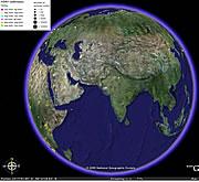
To demonstrate the potential of 'mashups', which weave together data from different sources (see 'Mashups mix data into global service' ), Nature has created a simple example - a global visualization of avian flu cases and outbreaks. To our knowledge, this is the only source where all of this information has been brought together. The mashup was first built in December 2005, and will be updated periodically (Download the mashup by clicking here . You will need Google Earth, which you can download here)
We used Google Earth to map over time each of the 1,800 or so outbreaks of avian flu in birds that have been reported over the past two years. The service also shows all confirmed human cases of infection with the H5N1 influenza virus in the same period.
The animal data was compiled from information held by the FAO, the World Organization for Animal Health (OIE) and various government sources, and was generously provided to Nature by the UN Food and Agricultural Organization (FAO) Emergency Prevention System (EMPRES) for Transboundary Animal and Plant Pests and Diseases. Nature compiled the data on human cases from World Health Organization bulletins.
Mapping the FAO data posed several challenges. The biggest was that the original datasets contained no latitude and longitude data for the outbreaks, so it was impossible to map them directly. FAO uses a UN system for defining geographical units such as place names, provinces and districts that can only shared internally within UN agencies, and so it was not available. Latitude and longitude data therefore had to be calculated for every outbreak location.
The data was structured into two databases, one for animal data and one for health data, and then converted to 'kml', an XML-based computer language that Google Earth uses as a standard for data exchange.
The Google Earth programme is then able to plot the cases and outbreaks by location and time, with links to relevant Web resources from FAO, WHO, and other organizations.
ADVERTISEMENT
The map is a 'beta', and although the data has been manually checked, errors in the positions of some locations cannot be excluded. The underlying animal data itself also suffers from underreporting of outbreaks, and omissions or inaccuracies in reporting. The FAO also notes with respect to its own data, "facts and figures are to the best of our knowledge accurate and up to date" and that "FAO assumes no responsibility for any error or omission in the datasets".
For further more-detailed information on methods, see Declan Butler's blog.
