
Abstract
With the recent expansion of urban greening interventions, the definition of spatial indicators to measure the provision of urban greenery has become pivotal in informing the policy-design process. By analyzing the stability of the population and area rankings induced by several indicators of green accessibility for over 1000 cities worldwide, we investigate the extent to which using a single metric provides a reliable assessment of green accessibility in a city. The results suggest that, due to the complex interaction between the spatial distribution of greenspaces in an urban center and its population distribution, a single indicator may inadequately differentiate across areas or subgroups of the population, even when focusing on one form of green accessibility. From a policy standpoint, this indicates the need to switch toward a multi-dimensional framework capable of organically evaluating a range of indicators at once.
Introduction
As the share of the worldwide population living in cities is forecast to rise to 68% by 20501, urban greening interventions and nature-based solutions are increasingly relied upon to improve the health outcomes and the well-being of urban communities as well as to mitigate the environmental footprint of cities2,3. The availability of Public Green Areas (PGAs) in a city has been linked to healthier lifestyles and increased social cohesion, as these are primarily used for physical activity, leisure, and social exchange4. Studies have shown that living next to a PGA leads to reduced mortality rates, lower risk of cardiovascular diseases, and improved mental health and cognitive functions5,6. PGAs are also effective solutions to pressing environmental challenges, providing biodiversity support and carbon storage but also acting as soil protectors and temperature regulators7,8,9,10.
The multi-faceted benefits of urban green found definitive recognition in the New Urban Agenda, adopted at United Nations Conference Habitat III in 201611 and in the United Nations (UN) Sustainable Development Goals12. Particularly, Goal 11.7 emphasizes the need for the universal provision of safe, inclusive, accessible, green, and public spaces for all demographics and, specifically, for the most vulnerable. By this principle, health organizations, local authorities, and various institutional bodies have established a spectrum of green-related targets for cities. While the World Health Organization (WHO) recommends access to at least 0.5–1 ha of public green within 300 m of residential locations for urban residents13, the broad range of benefits associated with exposure to nature has also been encoded into multi-level targets, setting different green requirements for increasing distances from residential locations (e.g.,14,15). Similarly, the recently proposed 3–30–300 paradigm addresses the need for urban green to percolate into the lives of urban residents at several levels. The paradigm indicates that three trees must be visible from every home, every neighborhood must have a 30% tree canopy cover, and every home must have a greenspace within 300 m16.
The proliferation of indicators and targets also reveals a progressive shift of the urban planning paradigm towards more data-driven policy design processes as a pathway to healthier and more sustainable cities. In this regard, the development of spatially-resolved indicators is seen as a first milestone to monitor progress towards specific goals but also to develop future data-driven urban policies, according to the principle what gets measured, gets done17,18.
Despite this, there is not yet an established and universally adopted framework to measure accessibility to urban green. Depending on the specific application and the available data sources, scholars in this domain have preferred one indicator to another, ranging from the minimum distance to the nearest park –using land use data from administrative sources, open crowd-sourced geodatabases (such as OpenStreetMap (OSM)) or processed satellite images19,20,21,22,23,24,25– to metrics evaluating the total green exposure from satellite data on land cover or green intensity measured through the normalized difference vegetation indicator26,27,28.
Moreover, unlike average city-level metrics, the definition of spatial indicators poses additional computational and methodological challenges as it requires considering the interplay between the spatial distribution of the population and greenspaces within a city, but also the walkable catchment of each sub-area as resulting from the topology of its street-network. A first large-scale characterization of green exposure to partially account for this interplay is provided in the Global Human Settlement Urban Center Database (GHS-UCDB)29, which includes a measure of the generalized potential access to green areas. This metric captures the immediate exposure to green, as residents are considered to be exposed exclusively to the green available within their residential cell, regardless of the characteristics of nearby areas. A recent study acknowledges the importance of measuring short-range and long-range metrics26. The authors compute green exposure for buffered regions with three progressively increasing radii around residential locations for Global South and Global North cities. Despite the recent progress in the characterization of the interplay between population and greenspaces, considerations on walkable catchment areas are still primarily neglected in the majority of large-scale studies due to their computational complexity (conversely, walkable catchments are typically considered in single-city settings, such as20,21,22,23). A first attempt in this sense is provided in ref. 24 for PGAs within 500 m of residential locations.
While the studies mentioned above examined green accessibility under the lens of the structural and topological features of urban areas, a strand of studies has begun integrating behavioral information derived from survey data or, more recently, from automated user-generated geographic information, including social media, sports tracking, mobile phone traces, and public participation geographic information systems (PPGIS)30,31,32,33. By using real mobility traces, these studies quantify actual greenspaces’ usage and green exposure levels (or green demand) in contrast to the potential green accessibility that can be inferred solely from structural considerations. Although these metrics represent substantial progress in the characterization of green accessibility by additionally shedding light on factors like the perceived quality or safety level of greenspaces, their large-scale implementation is often hindered by restricted data accessibility. Moreover, questions have been raised about the representativeness of some of these data sources, particularly regarding specific demographic groups34,35. Due to these challenges in implementing behavioral metrics, structural indicators are still predominantly adopted in evaluating green accessibility.
To the best of our knowledge, there has been no research effort dedicated thus far to investigating the interchangeability of accessibility patterns derived from various green accessibility indicators and the implications that the use of one or the other may have for policy planning. This gap in research stresses the need for a deeper exploration of how different indicators converge or/and diverge, and concurrently on the development of a coherent framework for the measurement of all these metrics.
By analyzing the accessibility pictures emerging from three families of accessibility classes, in this study, we argue that a comprehensive assessment of green provision in urban environments cannot overlook the inherently multi-dimensional nature of green accessibility, well-exemplified by multi-level targets. More specifically, our contribution to the study of green accessibility unfolds in three main dimensions. Firstly, our methodological contribution consists of defining a computational framework designed to operationalize the measurement of three families of green accessibility indicators—minimum distance, exposure, and per person. This framework allows for flexibility across various parameterizations, such as greenery type, minimum size of the preferred green area, and time constraints. These structural accessibility classes are rooted in green targets and recommendations defined by public health authorities, local governments, and other relevant stakeholders13,14,15. The framework, easily extendable to diverse urban settings –provided sufficient data quality– is currently deployed for over 1040 cities across 145 countries. Accessible to both policymakers and the general public, it is made available through a dedicated interactive web platform with a range of functionalities (see Data availability statement). Our second contribution involves a large-scale evaluation of the stability of these spatial green accessibility indicators to small changes in their underlying parameters. We aim to understand the reliability of fixed thresholding approaches in constructing spatial indicators by assessing how a fixed parametrization influences the ranking of areas and population subgroups within a city. The third contribution of the study undertakes a comprehensive investigation of the overlap among targets established by selected institutional bodies. This evaluation seeks to determine the interchangeability of accessibility pictures derived from different metrics, emphasizing the necessity of a multi-dimensional perspective. The results are presented in three distinct sections, each corresponding to the three contributions outlined in the study.
Results
Families of accessibility indicators
Building upon policy debate and recommendations of public health authorities13,14,15 on green accessibility and exposure, we defined a framework to measure three families of spatial indicators to characterize access and exposure to urban greenery, providing a multi-dimensional perspective:
-
Minimum distance: it measures the walking distance from a residential location to the nearest PGA in minutes.
-
Exposure: it measures the amount of urban green space available from a residential location within a walking time budget, in hectares. In contrast to the minimum distance indicator, which focuses solely on green areas that are both accessible and public, the exposure indicator assesses the overall presence of green features in the vicinity of a residential area, regardless of their accessibility or intended use. This approach expands our understanding of greenspace to encompass additional elements like roadside tree lines. To implement this broader perspective, we utilize the European Space Agency’s 2020 World Cover database as our primary data source to identify green elements rather than relying on OSM.
-
Per-person: it measures the per person availability of PGAs within a walking time budget from a residential location, in square meters. Unlike the previous two indicators, agnostic to population density, it incorporates the notion of competitiveness in using PGAs for specific activities. As a result, the level of public green available to a resident depends on the total green provision and the cumulative number of people living within the service area of each PGA.
The framework enables a flexible parameterization of all family indicators according to the minimum size of the PGAs/green features of interest, the type of greenery, and (when applicable) the time budget. The minimal geographical unit used in this study is a rectangular square of side equal to 9 arc-sec (around 196 m at a latitude of 45∘). The framework can be extended to any resolution level, providing enough computational resources. All distances are computed using the walkable street network and assuming a base walking speed of 5 km/h (it can vary depending on parameters such as the slope of a street, its pavement, the presence of stairs, and so on). Walkable distances can also be customized depending on the specific capabilities of the subject of interest, for example, the elderly population or residents with limited mobility.
Figure 1 provides a schematic representation of the framework and the operationalization of each family. A formal definition is provided in the Methods. The framework is implemented for over 1000 cities worldwide (Fig. 2). It is available to policymakers and the general public through a dedicated interactive web application (more information on the functionalities of the application is provided in the Data availability statement of this manuscript).

The panel displays a schematic representation of the proposed three families of green accessibility indicators. The indicators are mostly inspired by recommendations of public health authorities or local governments (as an example,13,14,15). a Minimum distance: The indicator measures the walking distance in minutes to the closest cell with a PGA with selected characteristics in terms of size and type of green for each residential cell. In the top-left panel, the red cell is the cell of interest. The remaining cells are nearby cells with a PGA, whose color is proportional to the distance to the cell of interest. b Exposure: The indicator measures the cumulative size of green features (in hectares) available within a walking time budget from a residential cell. In the top-right panel, the red cell is the cell of interest. The area within the walking time budget from the cell of interest is depicted with a dotted line. c Per-person: This indicator is computed in two steps. In the first step, all residents in the urban center are apportioned to PGAs—within the corresponding walking time budget— proportionally to the size of the PGA. In the second step, for each residential cell, the per-person indicator is computed as the ratio between the size of PGAs within the walking time budget from the cell of interest, and the total number of residents apportioned to these areas—irrespective of their residential location. In the bottom panel, the cell of interest, its residents, and the area within the corresponding walking time budget are depicted in black. The same information for competitor users from other residential cells is depicted in pink and blue. d Summary of the parameterization of each family of indicators. A formal definition of each family of indicators is provided in the Methods.

a The density plot reports the size (measured as log-population) distribution of cities included in the sample for each macro-area. Cities in the Russian Federation have all been attributed to Europe. b The map displays the number of cities included in the study for each country. Black indicates that no city was included for the corresponding country. Country boundaries were imported from OpenStreetMap.
Stability of the green accessibility indicators
Institutional targets and guiding principles frequently lack precision regarding the specific parametrization of an indicator, as illustrated, for instance, in13,14. However, we have limited knowledge about how changes to this parameterization affect the relative performance, in terms of green accessibility, of different city areas and sub-groups of the population. To address this gap, we analyze the impact of minor changes in the parameterization of each indicator family on three dimensions and introduce –where applicable– an appropriate stability metric.
-
(i)
The first dimension is the ranking, in terms of green accessibility, of the geographical units composing the city. We measure the stability of the rankings induced by two alternative parameterizations using the Kendall rank correlation coefficient36. This metric quantifies the degree of agreement between two ordered sets based on the ranking of their elements. In this first dimension, every geographical unit is equally important for assessing the ranking stability, and information on the number of residents in each cell is not factored in.
-
(ii)
To account for this, the second dimension extends the first one by additionally considering the population distribution in the city. Furthermore, rather than evaluating the entire ranking, for this dimension, we adopt a policy perspective by examining the stability of the population located at the lower end of the ranking, which may be the focus of policy interventions. To this scope, we propose two targeting strategies. With the first strategy, labeled naive targeting, we target the y% worst performing population, irrespective of the actual performance; with the second strategy, labeled most-disadvantaged targeting, we target subgroups of the population with low performance in either absolute term or relative to the rest of the population (see Methods). We then define the stability of an indicator to any two parametrizations (baseline vs. alternative) under a targeting strategy as the share of the overlapping targeted population (see Methods). For a stability level s, the proportion of the target population under one parameterization that would not be targeted under the alternative one (hereafter: conflicting target population) is given on average (across the two parameterizations) by \(\frac{(1-s)}{(1+s)}\).
-
(iii)
As a third dimension, we compute the observed inequality level under the indicator’s specific parameterization, measured through a weighted Gini indicator37.
The two initial dimensions are grounded in the considerations of policy design. Although there is no universally agreed-upon planning strategy, there is a consensus that interventions should focus on left-out subgroups of the population to mitigate urban inequities38. The inclusion of the third dimension stems, instead, from the growing use of the Gini indicator in measuring urban inequalities in green accessibility studies39,40,41,42.
Figure 3 illustrates the stability of the minimum distance indicator in response to variations in the minimum size of the PGA across our entire sample of cities (mean and inter-quartile range (IQR)), cities exceeding 1 million inhabitants (mean and IQR), and selected major urban centers worldwide. The assessment of parametrizations considers PGA sizes up to 5 ha against a baseline of 0.5 ha, while larger parametrizations are evaluated against a baseline of 7.5 ha. This two-step evaluation better ensures that the comparison is provided between PGAs of similar sizes and, potentially, similar usage.

a The maps depict in red target areas in London (UK) according to the 2% naive targeting approach for the minimum distance indicator with increasing minimum PGA size (from left to right: 0.5 ha, 1 ha, 2 ha, and 5 ha). The intensity of the red is proportional to the number of residents in the cell. b The charts depict the level of stability of the minimum distance indicator to different parameterizations and according to different stability metrics for six cities across all continents. The Most-disadvantaged targeting targets residents performing worse than three times the mean citizen. For the Rank correlation, 2% naive targeting and the Most-disadvantaged targeting, the comparison is provided with respect to the parametrization with minimum size equal to 0.5 ha for minimum sizes up to 5 ha and to 7.5 ha for larger minimum sizes. For the Gini indicator, the chart reports the indicator’s value under several parametrizations. c The charts report the median value (solid line) and the IQR (shaded area) of the stability metrics for all cities in our sample (black) and for cities with more than 1 million inhabitants (blue). A formal definition of each stability metric is provided in the Methods.
We observe a consistent decline in the median stability level as the minimum size of the PGA increases for both the targeting approaches. This trend is consistent among all cities regardless of population size. Notably, higher stability values at the area level (Fig. 3-Rank correlation) may mask significant reshuffling at the bottom of the population ranking. Under the 2% naive targeting strategy, the median stability level across all cities shifts from 0.77 [IQR: 0.48–1] for a parameter change from 0.5 ha to 1 hectare to 0.53 [IQR: 0.28–0.94] for a shift to 2 ha. This corresponds to a conflicting target population of 12% [IQR: 35%–0%] and 30% [IQR: 56%–3%], respectively. These results underscore substantial variability in stability depending on the specific green configuration of the urban center, along with concerning levels of instability, particularly in selected large cities. For instance, using the same parameterizations (minimum PGA size of 0.5 ha and 1 ha), the stability levels for Sydney (AUS), Rio de Janeiro (BRA), and London (UK) are 0.32, 0.36, and 0.47, respectively, corresponding to conflicting target population levels of 51%, 47%, and 36%. Similar trends emerge with the more restrictive most-disadvantaged targeting strategy, which tightly focuses on populations with low accessibility levels and employs different targeting levels from the naive targeting approach (see Supplementary Information (SI)). A visual assessment of the changes in the targeted population for the city of London (UK) is provided in the maps in the top row of Fig. 3, which display—in a scale of reds –targeted areas using the 2% naive targeting strategy under five parameterizations, with the intensity of the palette being proportional to the number of people living in the area. From the graphical comparison, we observe that:
-
1.
For small changes in the parameter (e.g., from 0.5 ha to 1 ha), most of the stable population (i.e., populations targeted under both parameterizations) is concentrated in low-density areas. While some (but fewer) higher-density areas are targeted in both scenarios, they tend not to overlap. It is worth noticing that this is not only a peculiarity of London but holds for most cities. Indeed Fig. 4 shows that the ratio between the population density of areas associated with a conflicting target population and areas with a stable target population is consistently above 1.
Fig. 4: Population density of conflicting and stable targeted areas. 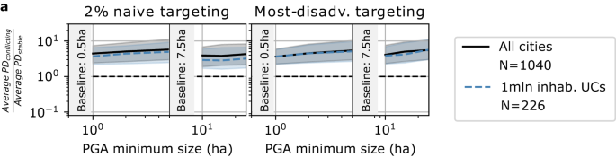
a The panel depicts the ratio of the average population density (PD) of the areas associated with the conflicting targeted population to the average PD of areas linked to the stable targeted population under two targeting strategies and a range of alternative minimum PGA sizes for the minimum distance indicator. The line is the median across all cities (in black) and cities with more than 1 million inhabitants (blue); the IQR for both cases is depicted as a shaded area.
-
2.
The degree of clustering of targeted areas increases along with the minimum size of the PGAs. This is due to the physical and geographical constraints of larger PGAs, which are typically fewer and less scattered around the city than smaller PGAs.

Finally, we explore the impact of parametrizations on the level of inequality within a city as measured through a weighted Gini indicator. Interestingly, we do not observe any typical pattern across cities. While some cities experience decreasing levels of inequality (e.g., Singapore (SGP)) as we increase the minimum size of the PGAs, others show increasing levels (New York (USA)) or U-shaped patterns (Sydney (AUS) and London (UK)). While this is likely to result from the interplay between the size composition of PGAs within a city and its spatial distribution, we do not assess the existence of specific regularities. Similar figures for the stability of the exposure and per-person indicators against the time budget (for both) and the minimum size of the PGAs (for the latter only) are provided in the SI (Supplementary Figs. 5–6) and the sensitivity analysis to the y parameter of the targeting strategies for all indicators (Supplementary Figs. 7–10). For the exposure indicator, we observe a median Rank correlation for cities in our sample of 0.69 [IQR: 0.63–0.74] for a shift in the time budget from 5 to 10 min and median stability levels of the 2% targeting strategy of 0.38 [IQR: 0.23–0.63] for a similar change in the time budget. See Data availability statement for the release of detailed stability metrics across our entire sample.
Stability of targets set by selected institutional bodies
This section focuses on the interplay between seven selected green accessibility indicators and the related institutional targets set by global public health organizations and local authorities. First, we evaluate the performance of a city against the targets. Subsequently, similar to the previous section, we analyze how the fraction of the population meeting these criteria is stable across different parametrizations. A comprehensive operational definition for each indicator and the corresponding target is outlined in Table 1. While an indicator provides a detailed accessibility metric, a target binaryizes the indicator by distinguishing values that meet the target criteria from those that do not.
The existence of well-defined green targets naturally induces a metric to measure the performance of cities in terms of green accessibility, i.e., measuring the proportion of the inhabitants of a city that satisfies the prescribed target. By coupling information on the green indicators and the population density, we estimate the proportion of the population meeting each target in each city. Figure 5a provides an overview of the performance of cities in our sample for each target, categorized by geographical area. Consistent with findings in other studies26,43, we observe a distinct geographical pattern across most indicators. Cities in Europe and Australia-Oceania generally outperform cities in the Global South and North America, particularly concerning minimum distance indexes and the per-person metric. While this pattern is less pronounced for the exposure metric, cities in Asia and Africa still exhibit more significant variation around the median than other geographical areas. Regardless of geographical location, a larger proportion of the urban population typically meets the exposure target than other targets. This disparity is more pronounced for cities in the Global South, where available green spaces are less likely to be organized in structured public areas, and for North American cities, which are often characterized by extensive suburbs with predominantly single-family homes featuring private gardens but fewer public spaces. The proliferation of green indicators reflects a recent surge in interest from local authorities and public health bodies in promoting greener urban environments. It also acknowledges the diverse array of benefits associated with exposure to nature. However, this proliferation reveals the existence of concurrent authorities, often operating at the same level, each establishing independent goals. In Fig. 5b, we evaluate the interchangeability of the accessibility perspectives derived from these indicators. Similarly to the previous section, we quantify the degree of disagreement between any pair of two indicators for each city through the stability of the population not satisfying the target (henceforth: targeted population) proposed by the institutional body. We observe greater stability for indicators within the same class than across indicators belonging to different classes. The lowest stability is observed between the WHO indicator and the ESA, reflecting differences in the types of green features incorporated in these indicators, particularly the inclusion of elements beyond parks, grasslands, and forests in the latter. When comparing the three short-distance MD indicators, we note a smaller overlap in the targeted population between WHO and B1 compared to the overlap between WHO and N1. The distinction arises from variations in the former’s time threshold and the latter’s minimum size, suggesting that the time dimension has a more significant impact than the size of the PGA in short-MD evaluation on the definition of the city performance and the targeted population.

a For each institutional target (see Table 1), the radial plot depicts the median (solid line) and IQR (shaded area) across cities in each geographical macro-area of the proportion of the population satisfying the target. The color of the plot reflects the class of the target. Cities in the Russian Federation have been attributed to Europe. b, c The box plots depict the cross-indicators' level of stability in the population non-satisfying with the corresponding institutional targets for all cities in the sample (black) and for cities with more than 1 million inhabitants (red).
Discussion
Implications of the study
While recent studies on urban greenery accessibility often compare cities or specific areas using a single indicator (for example20,21,22,23), this study emphasizes the importance of recognizing the inherently multi-dimensional nature of green accessibility in urban environments. After introducing a framework to evaluate three families of structural green accessibility indicators organically, the framework examines the similarity of accessibility outcomes arising from indicators within the same family but under different parameterizations across distinct families and according to institutional targets.
The findings in the first part of our study indicate significant instability in the ranking of both areas and populations, following perturbations in the parameterization of selected indicators. From a policy perspective, this suggests that relying on a single set of parameters may provide insufficient discrimination across areas and population subgroups with limited access, as the rankings induced by the indicators are not stable to minor changes. This emphasizes the need to evaluate the impact of fixed parameterization when assessing the relative performance of areas/population subgroups in a city with respect to a specific structural green accessibility metric. In addition, the analysis shows that consistently under-performing areas are typically less densely populated than so-called conflicting areas, entailing an additional challenge from a policy design perspective, as these stable areas may not be sufficiently populated to be meaningful targets for intervention. It is important to stress that the simplistic ranking-based prioritization strategies assessed in the initial phase of this study do not seek to represent a comprehensive policy-design process realistically. On the one hand, numerous real-world factors, such as environmental or financial constraints, could impede the feasibility of greening interventions in severely under-performing areas. On the other hand, valid reasons may exist to prioritize specific demographic groups, such as older adults or children, who may face more restricted mobility within the city. Furthermore, realistic policy design processes in urban environments must address complex issues like green gentrification phenomena and actively promote citizen participation through the use of co-creation approaches44,45,46,47,48,49. Given our study’s broad geographical scope, we could not detail these considerations. Instead, we focused on the identification of subgroups of the population that are consistently (e.g., across several indicators or perturbation of the same indicator) under-performing, seen as a first step towards the design of interventions to promote the reduction of urban inequalities effectively38.
The second part of the study focuses on specific institutional targets, aiming to evaluate the interchangeability of the induced accessibility pictures. Similar to the preceding analysis, the interchangeability between any two targets was assessed by examining the extent of overlap in populations that do not satisfy the criteria, e.g., potential target populations for interventions. Unsurprisingly, the findings suggest a limited degree of interchangeability for indicators from different families (e.g., minimum distance vs. exposure) or those aiming to capture different forms of green accessibility (e.g., short distance to small PGA vs. longer distance to larger PGA). This confirms the need to evaluate each form of green accessibility independently to provide a comprehensive picture in line with the multi-target recommendations of specific institutional bodies14,15. More interestingly, substantial discrepancies also emerged among targets seeking to capture similar forms of accessibility (e.g., targets WHO, B1, and N1, all short-distance indicators). This latter observation reinforces the results from the earlier section on the impact of a fixed parameterization, here adopting more realistic targeting approaches designed by specific institutional bodies.
While single-indicator approaches have been shown to perform well in studying the impact of green accessibility and exposure on outcomes such as human health and wellbeing (as in ref. 28), both sets of results of this study suggest that adopting a multi-indicator framework would provide a more nuanced picture of green accessibility. Such a framework serves a dual purpose: (1) assessing the impact of a fixed-threshold approach induced by a specific parameterization of an indicator and (2) organically evaluating multiple forms of green accessibility concurrently. This multi-dimensional approach becomes crucial for obtaining a comprehensive understanding of urban green accessibility, accounting for the nuances associated with various institutional targets and diverse forms of accessibility metrics, but also to overcome the limitation associated with fixed-threshold structural indicators.
Limitations of the study and future research
Despite the effort devoted to cleaning and processing the data to ensure the best possible standards, the main limitation of our work concerns the completeness of the mapping of green features in OSM. To limit the impact of this potential data bias, we undertook a series of filtering and checks to assess the quality of the OSM data in each urban center (see SI), resulting in more than halving the initial sample of cities (from around 2500 to 1040). However, the accessibility metrics that we measure intrinsically depend on the quality of these data, so low green feature quality would necessarily result in biased indicators. To promote transparency and facilitate the identification of these biases, we make all our data (including the raw data) easily navigable to the public with our interactive platform. Nonetheless, we deem the impact of this issue on the stability metrics performed in this study to be limited as the comparison is always provided within the same city rather than across cities. As such, this limitation does not undermine the main take-home message of this study. Another limitation of the work concerns the definition of PGAs for the minimum distance and the per-person indicators. Our definition of urban green relies entirely on the mapping of areas in OSM and, as such, on the assessment of the correct tag by the mapper(s). In the presence of heterogeneous standards for the mapping of PGAs, the characteristics of a PGA in terms of the level of green, type of services, and characteristics of the vegetation may vary, mainly depending on the country or the climate zone of the urban center. Once again, the interactive platform provides an initial attempt to control for this variability by allowing the user to customize the type of green to incorporate in the indicator, from a more restrictive definition to a more extensive one. Along these lines, one potential avenue for future research involves expanding the framework by incorporating new data layers. These additional layers could automatically enrich the characterization of urban green areas with policy-relevant features, such as the availability of services and facilities, biodiversity levels, and other environmental quality or safety metrics. While collaboration with local authorities can inform this feature-augmentation process, extending it to large-scale evaluation poses notable challenges. An associated research direction evaluates the various data sources available for extracting green features, considering their completeness and suitability for constructing green accessibility indicators. Although our initial attempt in this direction is outlined in the Supplementary Information of this study, our evaluation is currently limited to two data sources. Future research efforts are necessary to assess the diverse sources available systematically.
Methods
Definition of urban centers
Urban centers (UCs) –or cities, here used interchangeably– were defined according to the boundaries in the Urban Centre Database of the Global Human Settlement 2015, revised version R2019A (GHS-UCDB)29. UCs in the GHS-UCDB are not based on administrative entities but on specific cut-off values on the resident population and the built-up surface share in a 1 × 1 km global uniform grid. Out of 13,000 urban centers recorded in the database, we retained the most populated 50 UCs per country (the internationally recognized three-letter ISO code identifies a country), provided that they had at least 100,000 inhabitants. We further excluded UCs for which the quality of the OpenStreetMap (OSM) data50 was deemed insufficient according to the procedure described in the section Data cleansing and processing of the SI. The data validation was performed by comparing the green intensity appearing from OSM data (based on an extended definition of green)50 to the green intensity from the World Cover data 2020 from the European Space Agency (WC-ESA)51 and defining ad-hoc acceptance intervals for urban centers with different size and average green intensity based on the level of similarity observed for a set of reference cities. The final sample comprised 1040 UCs across 145 countries.
Geographical units of analysis
The geographical space of each UC was divided into a regular grid with a spatial resolution of 9 arcs (geographic projection: WGS-84), mimicking the grid of the population layer of the Global Human Settlement 2015 (GHS-POP)52. Cells in the grid are the smallest geographical unit of analysis for this study, meaning that all metrics were measured at this geographical level and, whenever appropriate, aggregated into higher geographical units (e.g., UC).
Definition of PGAs and other green features
In the manuscript, the terms PGAs and greenspaces are used interchangeably to indicate accessible green areas of public use. The terms urban green, green infrastructure, and green coverage instead are used to refer to all green features in an urban center, regardless of their use or their degree of accessibility. For each city, PGAs were extracted from OSM data following the pipeline described in the SI and reclassified into three classes: parks, grass, and forests. For each city, the green infrastructure is extracted from the WC-ESA 2020 (codes: 10, 20, and 30) following the pipeline described in the SI.
Data sources
For each UC, the accessibility metrics presented in this study were constructed by combining information from three data sources: 1 - the GHS-POP52, which provides granular worldwide population estimates (2015) based on census data and satellite information on built areas. 2 - OSM50 (accessed in May 2022). OSM data were used to extract spatial information on the location of PGAs used for the minimum distance and the per-person indicators and to compute walking distances within any two cells in the city. 3 - the World Cover data 2020 from the European Space Agency (WC-ESA)51, which provides the land cover inferred by Sentinel-1 and Sentinel-2 data at a 10 m resolution. WC-ESA data were used as the source of information on green elements for the exposure indicator. In addition, the WC-ESA data were used to validate the sample of UCs described in section Validation of the sample of cities of the SI.
Pre-processing of the data
For each UC, the data pre-processing comprised five phases – described in detail in section Data cleansing and processing of the SI.
-
1.
Extraction of the city boundary from the GHS-UCDB29.
-
2.
Extraction of the population distribution from the GHS-POP52, by clipping the worldwide information with the boundary of the UC buffered with a 3-km radius. The 3-km buffer was applied to ensure the computation of the accessibility metrics was not biased for cells near the boundary of the UC.
-
3.
Extraction and processing of the OSM data on PGAs. This phase consisted of three sub-steps. 1- extraction of a local osm.pbf dumps from the osm.pbf of the corresponding continent by clipping the continent-wide file with the boundary of the UC buffered with a 3 kilometers radius. 2 - extraction of all relations and closed ways associated with PGAs from the local dump; 3 - remapping of the information on the PGAs to the base-grid used for the analysis.
-
4.
Extraction and processing of the data on green coverage from the WC-ESA 202051. This phase consisted of two sub-steps. 1- extraction of a local .tiff from the global .tiff by clipping the worldwide file with the boundary of the UC buffered with a 3 km radius, following the procedure described here. 2 - remapping of the information on green coverage to the base-grid used for the analysis.
-
5.
Computation of the walking distance matrix for the centroids of the base-grid using the foot profile of the Open Source Routing Machine (OSRM) engine53 and the local osm.pbf file extracted at point 2.
The data was pre-processed in Python, JavaScript, and PostGIS.
Accessibility indicators
Following the policy recommendations on accessibility to nature in urban environments (as an example,13,14,15), we operationalized three classes of accessibility indicators -minimum distance, exposure, and per-person. In what follows: \({{{{\mathcal{N}}}}}_{c}\) is an ordered set of N elements representing the cells within the city boundary in the population grid of city \(c,{{{{\mathcal{M}}}}}_{c}\) is an ordered set of M elements representing the cells in the extended (3 km-buffered) grid for city c, Dc (\({D}_{c}^{+}\)) is an (N × M)-matrix ((M × M)-matrix) where each element di,j (\({d}_{i,j}^{+}\)) represents the walking distance (as per street-network) in minutes between the i-th element of \({{{{\mathcal{N}}}}}_{c}\) (\({{{{\mathcal{M}}}}}_{c}\)) and the j-th element of \({{{{\mathcal{M}}}}}_{c}\).
Minimum distance
This class of indicators measures the walking distance (in minutes) from a residential location to the nearest PGA. The indicator can be parameterized according to the minimum size of the green area and the type of green (combinations of parks, forests, and grass). For each cell i in the population grid \({{{{\mathcal{N}}}}}_{c}\), the indicator is defined as:
i.e., the minimum of the Hadamard product between the i-th row of Dc and the M-dimensional vector gdc taking value 0 or 1 to indicate the absence/presence of a green feature (with given characteristics in terms of size/type of green) in the corresponding cell of the extended grid \({{{{\mathcal{M}}}}}_{c}\).
Exposure
This class of indicators measures the overall amount of urban green available within a time budget (t min) from a residential location in hectares. As for the previous class, the indicator can be parameterized according to the value of t and the minimum size of the green area. For each cell i in the population grid \({{{{\mathcal{N}}}}}_{c}\), the indicator is defined as the sum of the green intensities measured on cells no more than t-minutes away from the cell of origin. I.e.:
where \({{\mathbb{1}}}_{(0,t]}({D}_{i,c})\) is an indicator function mapping each element of the M-dimensional vector Di,c to 0 if di,j is greater than t and to 1 otherwise. gic is an M-dimensional vector representing the size of the green features (with given characteristics in terms of size) in the corresponding cell of the extended grid \({{{{\mathcal{M}}}}}_{c}\).
Per-person
This class of indicators measures the per-person availability of PGAs within a time budget (t min) from a residential location in square meters. As for the previous classes, the indicator can be parameterized according to the value of t, the minimum size of the green area, and the type of green. For each cell i in the population grid \({{{{\mathcal{N}}}}}_{c}\), the indicator is computed as:
where gppt,c is an M-dimensional vector representing the squared meters of green available per-person in the corresponding cell of \({{{{\mathcal{M}}}}}_{c}\). More specifically, gppt,c is computed by dividing the green available in each cell by the total confluent population. I.e.:
where ⊘ refers to element-wise division, AP is the M-dimensional vector whose element apj,t,c equals the confluent population (for the time-threshold t) of the j-th element of \({{{{\mathcal{M}}}}}_{c}\). The affluent population of cell j is computed by assigning – for each residential cell i – shares of the population to cells in \({{{\mathcal{M}}}}\) within the time-budget t proportionally to the size of the available green in j. Formally, the confluent population of cell j in \({{{\mathcal{M}}}}\) for time-budget t is defined as:
Stability metrics
We evaluate the stability of each accessibility indicator to its parametrization through three metrics—the Kendall rank correlation coefficient across areas, the proportion of stable targeted population according to a naive targeting approach, and the proportion of stable targeted population according to a most-disadvantaged targeting approach. A formal definition of each metric is provided below.
Kendall rank correlation coefficient
Let RInd(x)[N] be the ranking induced by the accessibility indicator Ind with parametrization (x) on the set of cell \({{{{\mathcal{N}}}}}_{c}\) of the urban center c. The Kendall rank correlation coefficient36 between two parametrizations (1) and (2) of indicator Ind is given by:
where two pairs n1 and n2 in \({{{{\mathcal{N}}}}}_{c}\) are said to be concordant if either RInd(1)[n1] < RInd(1)[n2] and RInd(2)[n1] < RInd(2)[n2] or RInd(1)[n1] > RInd(1)[n2] and RInd(2)[n1] > RInd(2)[n2], otherwise they are discordant.
Naive targeting approach
Let Ind(x)[N] be the accessibility indicator Ind with parametrization (x) on the set of cell \({{{{\mathcal{N}}}}}_{c}\) of the urban center c. For the minimum distance indicator, let \({t}_{x}^{\star }(y)\) be
i.e., \({t}_{x}^{\star }(y)\) is the cutoff value of the indicator associated to the y% targeting strategy. Recalling that, unlike the minimum distance indicator, higher values of the exposure and per-person indicators are desirable, the cutoff value \({t}_{x}^{\star }(y)\) for these two families is defined as:
Then, for any two parametrizations (1) and (2) of Ind, for the minimum distance indicator, we define the proportion of the stable targeted population under the y% naive targeting approach as the following weighted Jaccard indicator:
where \({{\mathbb{1}}}_{x,{t}^{\star },y,n}={{\mathbb{1}}}_{\left[0,{t}_{x}^{\star }(y)\right)}(Ind(x)[n])\). For the exposure and per-person indicators:
where \({{\mathbb{1}}}_{x,{t}^{\star },y,n}={{\mathbb{1}}}_{[0,{t}_{x}^{\star }(y)]}(Ind(x)[n])\). It is noteworthy that given the presence of potential ties (some cells may have the same accessibility value) induced by Ind(x), the number of people belonging to the bottom y% of the induced ranking population might differ under Ind(1) and Ind(2).
Most-disadvantaged targeting approach
The approach to targeting the most disadvantaged is akin to the naive targeting method, with a key distinction. Rather than relying solely on a cutoff value determined by the ranking of the population, which remains agnostic to the actual value of the indicator, this approach determines the cutoff based on the indicator’s specific value.
The most-disadvantaged targeting approach is akin to the naive targeting approach. However, rather than relying solely on a cutoff value determined by the ranking of the population, which would remain agnostic to the actual value of the indicator, this approach determines the cutoff based on the indicator’s specific value.
For the exposure and per-person indicators, we define the target group as those with no exposure/per-person access under the indicator’s parameterization (x). As such, the proportion of the stable population in the target group under any two parameterizations (1) and (2) is defined as the resulting weighted Jaccard indicator:
For the minimum distance indicator, we define the most-disadvantaged target population as that subgroup that performs y-times worse than the average behavior across all citizens. As such, letting \({t}_{x}^{m}\) be the average value of the indicator under the parametrization (x), then:
where \({{\mathbb{1}}}_{x,{t}_{x}^{m},y,n}={{\mathbb{1}}}_{\left[0,y{t}_{x}^{m}\right)}(Ind(x)[n])\).
Reporting summary
Further information on research design is available in the Nature Research Reporting Summary linked to this article.
Data availability
The raw data are all publicly available. Detailed stability metrics for all cities in the sample can be downloaded at this link. All other processed data are available upon request and can be explored at http://atgreen.hpc4ai.unito.it/. To facilitate the use of our multi-indicator framework by policymakers, we built an interactive web platform with five functionalities: EXPLORE, MEASURE, COMPARE, CREATE and DRAW. After selecting the urban center of interest, the platform allows the user to: EXPLORE green areas identifiable in OpenStreetMap. The user can filter the green areas based on detailed OSM tags, the size of the area (in hectares), and the name (as reported in OSM). This functionality is mostly meant to provide an overview of the green features included in the indicators; MEASURE several pre-computed green accessibility indicators at 9-arcs geographical granularity. Policy recommendations by public health authorities and local governments inspire the indicators proposed. The map depicts the spatial variation of each indicator and the corresponding target. Summary metrics on the overall performance of the city in absolute terms and relative to the other cities are also provided; COMPARE the performance of each cell across any two indicators, selected among the pre-computed metrics at the point before. The comparison is provided by splitting the distribution of each indicator into four groups based on the distribution of the metric weighted by the population distribution and assigning each cell to the corresponding group; CREATE their indicators by setting each parameter to the desired level. The user can select the family of the indicator, the type of green (only green features from OSM can be selected for performance reasons), the minimum size of the green feature (in hectares), and, whenever applicable, the time budget (in minutes). By setting the desired level of the green accessibility (target), the user can then visualize areas satisfying the target and areas that are missing out.; and; DRAW a new green space and evaluate the impact on nearby areas in terms of enhanced green accessibility.
Code availability
The Python code developed for this project is available at this Github repository.
References
United Nations Department of Economic and Social Affairs. 2018 revision of world urbanization prospects. https://esa.un.org/unpd/wup/ (2018).
World Health Organisation. Urban green space interventions and health: A review of impacts and effectiveness. https://www.who.int/europe/publications/m/item/urban-green-space-and-health--intervention-impacts-and-effectiveness (2017).
European Commission, Directorate-General for Research and Innovation. Towards an EU research and innovation policy agenda for nature-based solutions & re-naturing cities - Final report of the Horizon 2020 expert group on ’Nature-based solutions and re-naturing cities’. https://data.europa.eu/doi/10.2777/479582 (2015).
World Health Organization. Regional Office for Europe. Urban green spaces: a brief for action. https://www.who.int/europe/publications/i/item/9789289052498 (2017).
Kondo, M. C., Fluehr, J. M., McKeon, T. & Branas, C. C. Urban green space and its impact on human health. Int. J. Environ. Res. Public Health 15, 445 (2018).
Callaghan, A. et al. The impact of green spaces on mental health in urban settings: a scoping review. J. Mental Health 30, 179–193 (2021).
Goddard, M. A., Dougill, A. J. & Benton, T. G. Scaling up from gardens: biodiversity conservation in urban environments. Trends Ecol. Evol. 25, 90–98 (2010).
Shafique, M., Xue, X. & Luo, X. An overview of carbon sequestration of green roofs in urban areas. Urban For. Urban Greening 47, 126515 (2020).
Shishegar, N. The impact of green areas on mitigating urban heat island effect: a review. Int. J. Environ. Sustain. 9, 119–130 (2014).
Massaro, E., Schifanella, R., Piccardo, M., Caporaso, L., Taubenböck, H., Cescatti, A. & Duveiller, G. Spatially-optimized urban greening for reduction of population exposure to land surface temperature extremes. Nat. Commun. 14, 2903 (2023).
United Nations Conference on Housing and Sustainable Urban Development (Habitat III). New Urban Agenda. https://habitat3.org/the-new-urban-agenda/ (2016).
United Nations, Department of Economic and Social Affairs - Sustainable Development. Transforming our world: the 2030 Agenda for Sustainable Development. https://sdgs.un.org/2030agenda (2015).
World Health Organization. Regional Office for Europe. Urban green spaces and health. A review of evidence. (2016).
Natural England. Nature nearby: accessible natural greenspace guidance. http://www.ukmaburbanforum.co.uk/docunents/other/nature_nearby.pdf (2010).
Berlin Senate Department for Urban Development and Housing. Versorgung mit öffentlichen, wohnungsnahen Grünanlagen - Supply of public, green areas close to apartments. https://www.berlin.de/umweltatlas/_assets/nutzung/oeffentliche-gruenanlagen/de-texte/kc605_2020.pdf (2020).
Konijnendijk, C. The 3-30-300 rule for urban forestry and greener cities. Biophilic Cities J. 4, 2 (2021).
Giles-Corti, B. et al. Creating healthy and sustainable cities: what gets measured, gets done. Lancet Glob. Health 10, 782–785 (2022).
Cohen, M. A systematic review of urban sustainability assessment literature. Sustainability 9, 2048 (2017).
Rigolon, A., Browning, M. & Jennings, V. Inequities in the quality of urban park systems: an environmental justice investigation of cities in the united states. Landscape Urban Plan. 178, 156–169 (2018).
Oh, K. & Jeong, S. Assessing the spatial distribution of urban parks using gis. Landscape Urban Plan. 82, 25–32 (2007).
Zhang, J., Yue, W., Fan, P. & Gao, J. Measuring the accessibility of public green spaces in urban areas using web map services. Appl. Geogr. 126, 102381 (2021).
Rahman, K. M. & Zhang, D. Analyzing the level of accessibility of public urban green spaces to different socially vulnerable groups of people. Sustainability 10, 3917 (2018).
Giuliani, G. et al. Modelling accessibility to urban green areas using open earth observations data: a novel approach to support the urban sdg in four european cities. Remote Sensing 13, 422 (2021).
Boeing, G. et al. Using open data and open-source software to develop spatial indicators of urban design and transport features for achieving healthy and sustainable cities. Lancet Glob. Health 10, 907–918 (2022).
Chênes, C., Giuliani, G. & Ray, N. Modelling physical accessibility to public green spaces in switzerland to support the sdg11. Geomatics 1, 383–398 (2021).
Chen, B. et al. Contrasting inequality in human exposure to greenspace between cities of global north and global south. Nat. Commun.13, 1–9 (2022).
Song, Y., Chen, B. & Kwan, M.-P. How does urban expansion impact people’s exposure to green environments? a comparative study of 290 chinese cities. J. Clean. Prod. 246, 119018 (2020).
Barboza, E. P. et al. Green space and mortality in european cities: a health impact assessment study. Lancet Planetary Health 5, 718–730 (2021).
Florczyk A., et al. GHS Urban Centre Database 2015, multitemporal and multidimensional attributes, R2019A. European Commission, Joint Research Centre (JRC) PID: https://data.jrc.ec.europa.eu/dataset/53473144-b88c-44bc-b4a3-4583ed1f547e (2019).
Heikinheimo, V. et al. Understanding the use of urban green spaces from user-generated geographic information. Landscape Urban Plan. 201, 103845 (2020).
Salgado, A., Yuan, Z., Caridi, I. & González, M. C. Exposure to parks through the lens of urban mobility. EPJ Data Sci. 11, 42 (2022).
Mears, M., Brindley, P., Barrows, P., Richardson, M. & Maheswaran, R. Mapping urban greenspace use from mobile phone gps data. Plos one 16, 0248622 (2021).
Vich, G., Marquet, O. & Miralles-Guasch, C. Green exposure of walking routes and residential areas using smartphone tracking data and gis in a mediterranean city. Urban For. Urban Greening 40, 275–285 (2019).
Venter, Z. S., Gundersen, V., Scott, S. L. & Barton, D. N. Bias and precision of crowdsourced recreational activity data from strava. Landscape Urban Plan. 232, 104686 (2023).
Garber, M. D., Watkins, K. E. & Kramer, M. R. Comparing bicyclists who use smartphone apps to record rides with those who do not: Implications for representativeness and selection bias. J. Transp. Health 15, 100661 (2019).
M. G. Kendall, “Rank Correlation Methods,” 4th Edition, Griffin, London, (1948).
Gini, C. On the measure of concentration with special reference to income and statistics. Colorado Coll. Publ. Gen. Series 208, 73–79 (1936).
Lowe, M. et al. A pathway to prioritizing and delivering healthy and sustainable cities. J. City Clim. Policy Econ. 1, 111–123 (2022).
Wüstemann, H., Kalisch, D. & Kolbe, J. Access to urban green space and environmental inequalities in germany. Landscape Urban Plan. 164, 124–131 (2017).
Wu, J., Peng, Y., Liu, P., Weng, Y. & Lin, J. Is the green inequality overestimated? quality reevaluation of green space accessibility. Cities 130, 103871 (2022).
Wen, C., Albert, C. & Von Haaren, C. Equality in access to urban green spaces: a case study in hannover, germany, with a focus on the elderly population. Urban For. Urban Greening 55, 126820 (2020).
Song, Y. et al. Observed inequality in urban greenspace exposure in china. Environ. Int. 156, 106778 (2021).
Han, Y., He, J., Liu, D., Zhao, H. & Huang, J. Inequality in urban green provision: a comparative study of large cities throughout the world. Sustain Cities Soc. 89, 104229 (2023).
Anguelovski, I. et al. Green gentrification in european and north american cities. Nat. Commun. 13, 3816 (2022).
Rigolon, A. & Németh, J. Green gentrification or ‘just green enough’: do park location, size and function affect whether a place gentrifies or not? Urban Stud. 57, 402–420 (2020).
Anguelovski, I. et al. Assessing green gentrification in historically disenfranchised neighborhoods: a longitudinal and spatial analysis of barcelona. Urban Geogr. 39, 458–491 (2018).
Maia, A. T. A., Calcagni, F., Connolly, J. J. T., Anguelovski, I. & Langemeyer, J. Hidden drivers of social injustice: uncovering unequal cultural ecosystem services behind green gentrification. Environ. Sci. Policy 112, 254–263 (2020).
Garcia-Lamarca, Mea Urban green boosterism and city affordability: For whom is the ‘branded’green city? Urban Stud. 58, 90–112 (2021).
Rigolon, A. & Collins, T. The green gentrification cycle. Urban Stud. 60, 770–785 (2023).
OpenStreetMap contributors. Planet dump [Dataset]. https://www.openstreetmap.org (2017).
Zanaga, D. et al. ESA WorldCover 10 m 2020 v100 (Version v100) [Data set]. Zenodo. https://doi.org/10.5281/zenodo.5571936 (2021).
Schiavina, M., Freire, S., MacManus, K. GHS-POP R2019A - GHS population grid multitemporal (1975-1990-2000-2015). European Commission, Joint Research Centre (JRC) [Dataset]. https://doi.org/10.2905/0C6B9751-A71F-4062-830B-43C9F432370F, http://data.europa.eu/89h/0c6b9751-a71f-4062-830b-43c9f432370f (2019).
Luxen, D. & Vetter, C. Real-time routing with openstreetmap data. In: Proceedings of the 19th ACM SIGSPATIAL International Conference on Advances in Geographic Information Systems. GIS ’11, pp. 513–516. ACM, New York, NY, USA. https://doi.org/10.1145/2093973.2094062 (2011).
Acknowledgements
We thank Dr. Patricio Reyes, Dr. Fernando Cucchietti, and the rest of the Data Analytics and Visualization team at the Barcelona Supercomputing Center (BSC-CNS) for the insightful conversations and suggestions. This work has been partially supported by the Spoke 1 FutureHPC & BigData of ICSC - Centro Nazionale di Ricerca in High-Performance-Computing, Big Data and Quantum Computing, funded by European Union - NextGenerationEU. RS acknowledges partial support from the European Union’s Horizon 2020 research and innovation program under grant agreement No. 869764 (GoGreenRoutes). R.S. acknowledges partial support from the Severo Ochoa Mobility Program at BSC-CNS. The funders had no role in study design, data collection and analysis, decision to publish, or manuscript preparation.
Author information
Authors and Affiliations
Contributions
A.B. performed the data collection, processed and cleaned the data, built the database and the back end of the interactive web platform, designed and performed the analysis, and drafted the manuscript. R.S. designed and supervised the study, revised the manuscript, and built the front end of the interactive web platform. Both authors approved the final version of the manuscript and are accountable for all aspects of the work in ensuring that questions related to the accuracy or integrity of any part of the work are appropriately investigated and resolved. A.B. performed most of the work while visiting the Barcelona Supercomputing Center (BSC-CNS).
Corresponding authors
Ethics declarations
Competing interests
The authors declare no competing interests.
Additional information
Publisher’s note Springer Nature remains neutral with regard to jurisdictional claims in published maps and institutional affiliations.
Supplementary information
Rights and permissions
Open Access This article is licensed under a Creative Commons Attribution 4.0 International License, which permits use, sharing, adaptation, distribution and reproduction in any medium or format, as long as you give appropriate credit to the original author(s) and the source, provide a link to the Creative Commons licence, and indicate if changes were made. The images or other third party material in this article are included in the article’s Creative Commons licence, unless indicated otherwise in a credit line to the material. If material is not included in the article’s Creative Commons licence and your intended use is not permitted by statutory regulation or exceeds the permitted use, you will need to obtain permission directly from the copyright holder. To view a copy of this licence, visit http://creativecommons.org/licenses/by/4.0/.
About this article

Cite this article
Battiston, A., Schifanella, R. On the need for a multi-dimensional framework to measure accessibility to urban green. npj Urban Sustain 4, 10 (2024). https://doi.org/10.1038/s42949-024-00147-y
Received:
Accepted:
Published:
DOI: https://doi.org/10.1038/s42949-024-00147-y
