Use box plots to illustrate the spread and differences of samples.
Visualization methods enhance our understanding of sample data and help us make comparisons across samples. Box plots are a simple but powerful graphing tool that can be used in place of histograms to address both goals. Whereas histograms require a sample size of at least 30 to be useful, box plots require a sample size of only 5, provide more detail in the tails of the distribution and are more readily compared across three or more samples. Several enhancements to the basic box plot can render it even more informative.
Box plots characterize a sample using the 25th, 50th and 75th percentiles—also known as the lower quartile (Q1), median (m or Q2) and upper quartile (Q3)—and the interquartile range (IQR = Q3 − Q1), which covers the central 50% of the data. Quartiles are insensitive to outliers and preserve information about the center and spread. Consequently, they are preferred over the mean and s.d. for population distributions that are asymmetric or irregularly shaped and for samples with extreme outliers. In such cases these measures may be difficult to intuitively interpret: the mean may be far from the bulk of the data, and conventional rules for interpreting the s.d. will likely not apply.
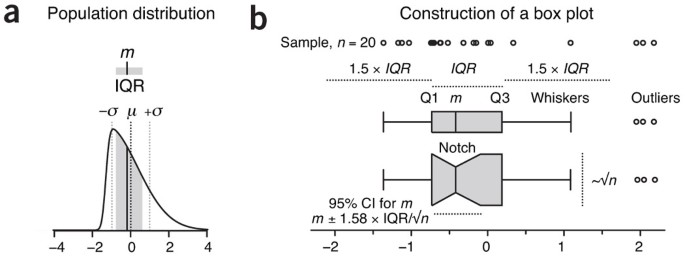
The core element that gives the box plot its name is a box whose length is the IQR and whose width is arbitrary (Fig. 1). A line inside the box shows the median, which is not necessarily central. The plot may be oriented vertically or horizontally—we use here (with one exception) horizontal boxes to maintain consistent orientation with corresponding sample distributions. Whiskers are conventionally extended to the most extreme data point that is no more than 1.5 × IQR from the edge of the box (Tukey style) or all the way to minimum and maximum of the data values (Spear style). The use of quartiles for box plots is a well-established convention: boxes or whiskers should never be used to show the mean, s.d. or s.e.m. As with the division of the box by the median, the whiskers are not necessarily symmetrical (Fig. 1b). The 1.5 multiplier corresponds to approximately ±2.7σ (where σ is s.d.) and 99.3% coverage of the data for a normal distribution. Outliers beyond the whiskers may be individually plotted. Box plot construction requires a sample of at least n = 5 (preferably larger), although some software does not check for this. For n < 5 we recommend showing the individual data points.
(a) The median (m = −0.19, solid vertical line) and interquartile range (IQR = 1.38, gray shading) are ideal for characterizing asymmetric or irregularly shaped distributions. A skewed normal distribution is shown with mean μ = 0 (dark dotted line) and s.d. σ = 1 (light dotted lines). (b) Box plots for an n = 20 sample from a. The box bounds the IQR divided by the median, and Tukey-style whiskers extend to a maximum of 1.5 × IQR beyond the box. The box width may be scaled by √n, and a notch may be added approximating a 95% confidence interval (CI) for the median. Open circles are sample data points. Dotted lines indicate the lengths or widths of annotated features.
Sample size differences can be assessed by scaling the box plot width in proportion to √n (Fig. 1b), the factor by which the precision of the sample's estimate of population statistics improves as sample size is increased.
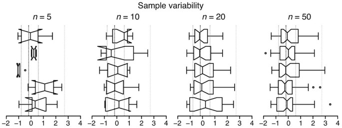
To assist in judging differences between sample medians, a notch (Fig. 1b) can be used to show the 95% confidence interval (CI) for the median, given by m ± 1.58 × IQR/√n (ref. 1). This is an approximation based on the normal distribution and is accurate in large samples for other distributions. If you suspect the population distribution is not close to normal and your sample size is small, avoid interpreting the interval analytically in the way we have described for CI error bars2. In general, when notches do not overlap, the medians can be judged to differ significantly, but overlap does not rule out a significant difference. For small samples the notch may span a larger interval than the box (Fig. 2).
The exact position of box boundaries will be software dependent. First, there is no universally agreed-upon method to calculate quartile values, which may be based on simple averaging or linear interpolation. Second, some applications, such as R, use hinges instead of quartiles for box boundaries. The lower and upper hinges are the median of the lower and upper half of the data, respectively, including the median if it is part of the data. Boxes based on hinges will be slightly different in some circumstances than those based on quartiles.
Aspects of the box plot such as width, whisker position, notch size and outlier display are subject to tuning; it is therefore important to clearly label how your box plot was constructed. Fewer than 20% of box plot figures in 2013 Nature Methods papers specified both sample size and whisker type in their legends—we encourage authors to be more specific.
The box plot is based on sample statistics, which are estimates of the corresponding population values. Sample variability will be reflected in the variation of all aspects of the box plot (Fig. 2). Modest sample sizes (n = 5–10) from the same population can yield very different box plots whose notches are likely to extend beyond the IQR. Even for large samples (n = 50), whisker positions can vary greatly. We recommend always indicating the sample size and avoiding notches unless they fall entirely within the IQR.
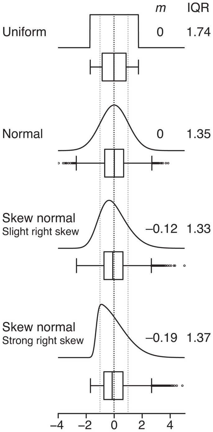
Although the mean and s.d. can always be calculated for any sample, they do not intuitively communicate the distribution of values (Fig. 3). Highly skewed distributions appear in box plot form with a markedly shorter whisker-and-box region and an absence of outliers on the side opposite the skew. Keep in mind that for small sample sizes, which do not necessarily represent the distribution well, these features may appear by chance.
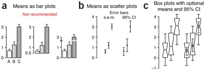
We strongly discourage using bar plots with error bars (Fig. 4a), which are best used for counts or proportions3. These charts continue to be prevalent (we counted 100 figures that used them in 2013 Nature Methods papers, compared to only 20 that used box plots). They typically show only one arm of the error bar, making overlap comparisons difficult. More importantly, the bar itself encourages the perception that the mean is related to its height rather than the position of its top. As a result, the choice of baseline can interfere with assessing relative sizes of means and their error bars. The addition of axis breaks and log scaling makes visual comparisons even more difficult.
Data are shown for three n = 20 samples from normal distributions with s.d. σ = 1 and mean μ = 1 (A,B) or 3 (C). (a) Showing sample mean and s.e.m. using bar plots is not recommended. Note how the change of baseline or cutting the y axis affects the comparative heights of the bars. (b) When sample size is sufficiently large (n > 3), scatter plots with s.e.m. or 95% confidence interval (CI) error bars are suitable for comparing central tendency. (c) Box plots may be combined with sample mean and 95% CI error bars to communicate more information about samples in roughly the same amount of space.
The traditional mean-and-error scatter plot with s.e.m. or 95% CI error bars (Fig. 4b) can be incorporated into box plots (Fig. 4c), thus combining details about the sample with an estimate of the population mean. For small samples, the s.e.m. bar may extend beyond the box. If data are normally distributed, >95% of s.e.m. bars will be within the IQR for n ≥ 14. For 95% CI bars, the cutoff is n ≥ 28.
Because they are based on statistics that do not require us to assume anything about the shape of the distribution, box plots robustly provide more information about samples than conventional error bars. We encourage their wider use and direct the reader to http://boxplot.tyerslab.com/ (ref. 4), a convenient online tool to create box plots that implements all the options described here.
References
McGill, R., Tukey, J.W & Larsen, W.A. Am. Stat. 32, 12–16 (1978).
Krzywinski, M. & Altman, N. Nat. Methods 10, 921–922 (2013).
Streit, M. & Gehlenborg, N. Nat. Methods 11, 117 (2014).
Spitzer, M. et al. Nat. Methods 11, 121–122 (2014).
Author information
Authors and Affiliations
Ethics declarations
Competing interests
The authors declare no competing financial interests.
Rights and permissions
About this article
Cite this article
Krzywinski, M., Altman, N. Visualizing samples with box plots. Nat Methods 11, 119–120 (2014). https://doi.org/10.1038/nmeth.2813
Published:
Issue Date:
DOI: https://doi.org/10.1038/nmeth.2813
This article is cited by
-
Cage escape governs photoredox reaction rates and quantum yields
Nature Chemistry (2024)
-
A novel ionospheric TEC mapping function with azimuth parameters and its application to the Chinese region
Journal of Geodesy (2024)
-
International bureaucrats’ attitudes toward global climate adaptation
npj Climate Action (2023)
-
The Microbiota of a Mite Prey-Predator System on Different Host Plants Are Characterized by Dysbiosis and Potential Functional Redundancy
Microbial Ecology (2023)
-
An API for dynamic estimation of reference intervals for functional abundances of gut microbiota
Biologia (2023)


