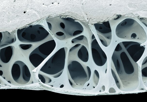
Coloured scanning electron micrograph of cancellous (spongy) bone from a starling's skull. Including key information in a paper about how microscopy images were produced, for example, the make and model of the microscope, is important for reproducibility.
Credit: STEVE GSCHMEISSNER/SCIENCE PHOTO LIBRARY/Getty images
3 ways to make your scientific images accurate, informative and accessible
It’s all in the detail, from colour choice to how methods are documented, and everything in between.
8 February 2021

STEVE GSCHMEISSNER/SCIENCE PHOTO LIBRARY/Getty images
Coloured scanning electron micrograph of cancellous (spongy) bone from a starling's skull. Including key information in a paper about how microscopy images were produced, for example, the make and model of the microscope, is important for reproducibility.
Skilfully crafted scientific illustrations, figures and graphs can make a paper more accessible to members of the public and the research community.
When supported by the right tools, these visual elements are an important way to present complex information such as statistical modelling and¬ biological systems.
Here, three researchers share their advice on how to create sci¬entific figures that are both accurate and engaging.
1. Use an image-processing workflow
Through her experience teaching visual communication to PhD students and postdoc researchers, Helen Jambor, a biologist at the Dresden Technical University in Germany, says many lack sufficient training in preparing visualizations and charts for publication.
An image-processing workflow is a valuable way to ensure there is consistency across multiple files, that the images are protected through back-ups and safe transfers, and that the most relevant information is drawn out in the images, whether through manipulations such as cropping and filtering.
In 2020, Jambor and her colleague Christopher Schmied, a bioimage analyst at the Leibniz Institute for Molecular Pharmacology in Berlin, published a step-by-step image-processing workflow for researchers:
 Credit: Jambor and Schmied
“I see our workflow as an easy-to-use ‘cheat sheet’ for learning the principles behind creating scientific figures and how to implement them with commonly used, free image-processing software, such as FIJI/ImageJ,” says Jambor.
2. Be mindful of colour choice
When Shyam Saladi was teaching a class for undergraduates, it dawned on him that rainbow colour maps are the default method for visualizing biological structures.
Also used in fields such as geosciences and physics, colour maps take a set of numbers and convert them to corresponding colours to make it easier for the reader take in a lot of information at once.
Researchers such as Saladi, a biophysicist at the California University of Technology (CalTech) in Pasadena, California, are questioning the use of popular rainbow colour maps such as Jet, which uses the full spectrum of colours to represent continuous numerical data or scale.
According to Saladi, rainbow colour maps can lead to misinterpretation because of how people perceive different colours.
For instance, humans are naturally attracted to bright colours, such as yellow and red. Some audiences may perceive areas represented by those colours as being more significant than areas in more muted or darker colours, such as blue and purple. Or, due to stark differences in colour, they may perceive greater variations in the data values represented than actually exist.
Not only is there a risk of misrepresenting the data through the use of rainbow colour maps, but they can pose problems for people with colourblindness, if they have trouble differentiating reds and greens, for example.
The example below, published in a Nature Communications paper led by Fabio Crameri from the Centre for Earth Evolution and Dynamics at the University of Oslo in Norway, compares an image that has data expressed in a rainbow (Jet) colour map and batlow, described as a “scientifically derived” colour map because it has been designed to more intuitively and inclusively represent data.
Crameri and his colleagues favour colour maps like batlow that are perceptually uniform, meaning equal steps in data can be perceived as equal steps in colour changes. In a rainbow spectrum, for instance, humans tend to notice the transition from yellow to green more than they notice a transition through the green part of the spectrum.
In the example below, it’s clear that the rainbow colour map has distorted the images of Marie Curie, the apple, and the globe, because we can directly compare them to the originals. Certain features in red, such as Curie’s forehead and the right side of her face, and the bite in the apple, become dominant, because red is more noticeable than blue, and the transition from yellow to red is striking.
 Credit: Fabio Crameri et al./Nature Communications
Here’s another example, published on the European Geosciences Journal blog by Crameri, comparing a rainbow colour map with more perceptually uniform colour maps:
 Credit: Fabio Crameri
To give researchers access to more accurate and inclusive colour palettes such as batlow, Saladi and his colleagues at CalTech created open-source plugins that researchers can download and run on their preferred image-processing software.
3. Document your experimental methods carefully
An important part of ensuring the reproducibility of a paper is documenting the processes used to produce microscopy images. According to Guillermo Marqués, scientific director at the University of Minnesota’s Imaging Centers in Minneapolis, many papers do not contain adequate information regarding microscopy experiments. This hinders reproducibility.
“This can lead to wasted time and resources in figuring out how the experiment was done,” says Marqués.
Marqués and his team have developed a free tool that processes detailed information about how the image was captured from the image file itself. The tool, called MethodsJ, extracts metadata, such as the microscope model, objective lens magnification, and exposure time from a light microscopy image, and generates text that can be used in the ‘materials and methods’ section of an article.
A new version, called MethodsJ2, is under development by a larger international collaboration, and will offer options for researchers to manually add missing imaging information the microscope cannot generate.
Marqués also recommends that researchers take initiative in developing and following publishing standards for all types of scientific images.
Resources such as QUAREP-LiMi, which runs an international working group of light microscopists from academia and industry who aim to establish new microscopy publishing standards, and the BioImaging North America group, a network of optical imaging scientists, students, and innovators who are working to improve image rigour and reproducibility, are good starting points, he says.