Imagine trying to tackle COVID-19 with no idea of where it was spreading or how quickly, the mortality risk or the efficacy of treatments and vaccines. That describes the first half of 2020. Countries published intermittent snapshots of the situation. The World Health Organization (WHO) published case numbers in PDFs.
Volunteers did most of the early work to supply informative data. Johns Hopkins University in Baltimore, Maryland, built the first dashboard to show global cases. The COVID Tracking Project — an initiative run by the publication The Atlantic — tracked data across the United States. The world relied on private media organizations — including The Economist, The New York Times and the Financial Times — to track outbreaks and metrics such as excess mortality.
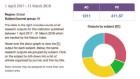
Our small team at Our World in Data quickly pivoted from gathering long-term global-development data to building data-collection and visualization tools that we updated daily. Anyone could use these to track confirmed cases and deaths across countries and over time, and make comparisons adjusted for population size, density, demographics and income. Every day, these charts appeared in news stories. They were used by national leaders in briefings and interviews, and even by the WHO. We built a global testing database from scratch, bringing together figures from as many nations as possible: we could collect some data readily, such as those from the UK Office for National Statistics, whose data sets were built to allow automated data scraping, but for others we had to manually collect information from images that organizations posted to social media.
When vaccines were rolled out, we assumed international institutions would be ready to track immunization. They weren’t. Our team stepped in to build data sets on global vaccinations, and we made all data and code openly available.
Sustainable development will falter without data
I get e-mails daily from policymakers, investors, researchers and journalists asking for data on other issues — energy or the Sustainable Development Goals, say — that are impossible to find. Instead of leaving such work to volunteers, global institutions should marshal the funding and expertise to collect crucial data, and mandate their publication.
The late statistician Hans Rosling famously described a phenomenon called ‘database hugging disorder’ — organizations’ tendency to guard data. Many were cured: the Organisation for Economic Co-operation and Development in Paris has an open statistical platform; the United Nations and the WHO are making more public-health metrics accessible. But organizations tackling other global problems lag far behind.
Consider climate change. We need to know how much energy countries consume and from which sources, and how much each sector (such as electricity, road transport, aviation and heating) demands. These data are gathered by the International Energy Agency, which is based in Paris and funded mainly by governments. But researchers must pay thousands of dollars to use them.
The IEA’s chief funders — the energy ministries of the world’s richest countries — stipulate that it raises around one-fifth of its operating costs this way. This amounts to just €5 million (US$5.8 million) to €6 million per year, equal to 0.03% of the total public-energy research and development budget for IEA countries in 2018. But, even at discounted rates, those fees keep researchers and policy experts in poorer countries out of the conversation. Plus, researchers who can access the data cannot fully share their analyses.
As a result, many rely on data published by the giant UK oil and gas company, BP, but these don’t include information about most low-income countries, breakdowns by sectors, or ‘final energy’: that which is actually consumed, rather than wasted in conversion processes.
Data can help to end malnutrition across Africa
Also consider the UN Sustainable Development Goals, which all UN countries agreed to achieve by 2030. The UN has set out 231 indicators towards these, but has not made it easy to track progress. So we created the SDG Tracker — a dashboard for users to explore progress — and found that there were no data for more than one-fifth of the indicators.
There are two key problems to fix. First, open data are often available only at the national level; governments provide them as national public goods, but there is rarely funding or resources available for anyone to pull data from different countries together. Second, many data that are publicly available are inaccessible. Often, they are stuck behind paywalls in academic journals, or are too difficult to find and use. The UN Food and Agriculture Organization publishes invaluable data on the global food system, but requires users to download hundreds of separate spreadsheets to understand the most basic trends. The metrics supplied with the data are frequently hard to understand and navigate.
What will help? International institutions need data divisions that are properly financed. The World Bank is a successful example. Its World Development Indicators provide a connected overview of some of the most pressing problems in global health, poverty and development, and they are freely accessible. Research grants should also require results to be shared — in a way that is accessible and understandable to policymakers and the public.
Problems that cross borders cannot be solved by any country alone: data need to be coordinated and supported internationally. The recognition of new SARS-CoV-2 variants, new COVID-19 outbreaks and areas lacking in vaccine access has been made clearer by open and global coordination. To tackle global problems, the world must create open data.
 Why the United States is having a coronavirus data crisis
 Sustainable development will falter without data
 Data can help to end malnutrition across Africa