Nature’s logo in 1869 and 2019.
Should science be ugly? This is a serious question asked by serious people at seminars. Some assume that an aesthetically appealing presentation signals at best a lack of priorities, and at worst a lack of rigour.
I disagree. Science sorely needs best practices in visual communication as well as in information design, a mature field with quantitative methods. In my view, the idea that scholarly publishing should be divorced from evidence-based applications of good visual design is perplexing.
Looking back over the past 150 years of Nature, we see an aesthetic that bends with time and trends, from ornate Victorian embellishments in 1869 to stark minimalism in the late 1960s. But design is not solely about how something looks; it is also concerned with how it works, and that understanding has never been more urgent than in the digital age. Design as a discipline exists to solve problems, and working researchers, readers and contributors have many. As publishers, we’ve asked how we might assist working scientists. We have heard your pleas, many stemming from information overload and the need to pack ever more data on to small screens.

So we are refreshing Nature’s look, and not just in honour of our 150th anniversary. We are in the early stages of our evolution towards designing for readers’ digital reality. Here is a tour of what is different, and why and how we have changed it.
Typography
A custom typeface, Harding, has been created for Nature’s new logo and much else: you’re reading it right now. Harding is named after the late neurologist Anita Harding. Brilliant and generous, she published in Nature before she died in 1995 at age 42. According to colleagues, she was known for taking questions from the clinic back into the laboratory, and for her wry sense of humour. When she learnt that she had a terminal illness, she apparently joked that at least she wouldn’t have to buy Windows 95.
Our team designed the typeface specifically for science, in partnership with Commercial Type founders Christian Schwartz in New York and Paul Barnes in London, and with London designer Mark Porter, whom Nature engaged for the overall redesign. Care was taken to identify the needs of technical material, because scholarly articles use classic type styles in unique ways. For instance, papers often have mathematical equations and formulae in the sub- and superscript lines, along with Greek letters and special characters. So we have made the sub- and superscript characters larger than standard, and created a Greek alphabet carefully honed to convey scientific meaning rather than typical Greek-language prose — for example, clearly rendering an alpha (α) in a shape that looks like a mathematical symbol, so that it is not easily confused with a Latin italic letter a. We have also made the italics more slanted so they are more distinct; single italic characters, such as h for Planck’s constant, are often used as isolated symbols with scientific meaning.

Harding is designed to cope across the disciplines. It boasts an unusually large range of special characters, from triple prime and nabla to a full set of astronomical symbols and the ‘click’ phonemes found in some African languages.
A key consideration in Harding’s overall design is performance on small digital screens. To boost readability in a limited space, it helps to enlarge the main portion of the lower-case letters, while making the ascenders and descenders (as in ‘h’ and ‘g’, respectively) smaller. Ultimately, this renders long, complex strings of words easier to parse, and allows for neat stacking of lengthy technical research-article titles over a number of lines.
The ‘flavour’ of the typeface — the feelings it evokes, its personality — evolved over several months. We initially looked at six fledgling concepts, each with distinct letterforms such as rounded serifs (the small strokes at the end of letters). After we winnowed these down to two, Harding emerged as the clear winner. We aimed for an overall impression of calm, rational intelligence with perhaps a dash of British formality and wit.
The myriad design considerations behind Nature’s new typeface serve one goal: to improve the reading experience for researchers and policymakers globally, and enhance comprehension and insight.

Logo
Nature has had at least ten logos since 1869, reflecting the styles of successive eras. All, up to now, were designed for print. The relatively large, luxurious physical space of a printed cover allows for fine detail in a way mobile devices do not. Finely worked features, digitized into pixels, can look fuzzy on smartphone screens.

Using the Harding typeface as a basis, we have updated the logo. Weight contrast — the variation of thin and thick lines in a letterform — was an important factor because high contrast aids pixellation on the small screen. For the logo, we modified Harding slightly, adding a tail to the letter ‘a’ and a rounder terminal on the ‘r’, to align it with recent versions of the logo. There’s an echo of the Baskerville Old Style logo from the early 1970s, but engineered for digital performance. And our team has retained the democratic lower-case ‘n’ that has been in use for almost 50 years.
We have also prioritized digital platforms by simplifying all Nature-branded journal logos. This was a particular challenge for journals with very long names, such as Nature Structural and Molecular Biology. Because social-media channels have grown in importance, we have also created a system of abbreviated forms for the tiny avatars on those platforms.

Social media avatars using Nature’s 2019 logo.
Colour
Perhaps the most radical change to Nature’s look is the removal of the red bar from the top of its web page. The journal design has incorporated red only since the late 1990s. (Before that, orange persisted in the logo and printed pages for four decades.) Nature’s ‘red period’ was intertwined with the rise of the web, but as digital design language has matured, red is now often associated with unpleasant online features such as error messages. More importantly, by removing the red, we help content to stand out more cleanly. Research shows that elimination of unnecessary colour elements eases cognitive load.
All these elements — typography, logos and colour — form the basis of Nature’s new design language across digital, print and anywhere you might find us, from coffee table to Twitter feed. This language will most certainly evolve, driven by researchers’ needs.
 How to land a journal cover
 Data visualization: Drawing out the meaning
 Picturing science
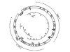 Deletions of muscle mitochondrial DNA in patients with mitochondrial myopathies