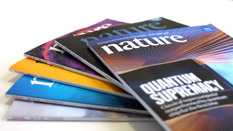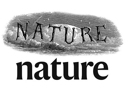
Credit: Nature
From today, Nature will look a little different. We are unveiling a redesign that will, we hope, help us fulfil our mission to serve researchers and disseminate scientific knowledge worldwide.
This design has been in development for well over a year, and is a much-needed update that helps us — in our 150th year — to communicate science with fresh clarity and style. We love it, and we hope that you, our readers, do, too.
Nature has had a number of design transformations over its history — but they were all based on one assumption: that our content would be accessed through the medium of static ink printed on a physical page. Not any more. That’s why we have developed a design that is suited to digital platforms — where the vast majority of readers now find us — while at the same time producing a clear and engaging printed edition.
In surveys and interviews, readers told us that our text can be hard to read; and that research articles increasingly need to do justice to complex data sets. We knew that it would be challenging to come up with a compelling design that meets these needs and also works across formats, but working with renowned editorial designer Mark Porter, we listened, we experimented and we have now acted.
The design decisions behind Nature’s new look
One of the first things you might notice is that the Nature logo has changed — this will be the 11th iteration. It’s a fresh take on the nature-with-a-small-n that we’ve used for the past half-century. But it’s not just the logo that is new — all our text is now in a custom typeface called Harding, named in memory of Anita Harding, an inspirational professor at London’s Institute of Neurology who made important contributions to neurogenetics before her death at the age of just 42.
Working with designers and typographers at Commercial Type, we spent months crafting the typeface to integrate it into Nature’s overall design language, inspired by the mid-century Swiss modernist school of rational design. This design school — sometimes called the internationalist school — emerged in response to nationalist design trends before and during the Second World War. It promoted the idea that graphic design should be based on a mathematical grid, allowing designers to arrange type and images with a semblance of order, as Nature’s creative director Kelly Krause explains in this issue.
The result is a printed journal with text that should be easier to read. We have also adjusted some of the organization and labelling to help readers navigate between sections. From now on, all our research content will also be published in the ‘Article’ format; the shorter, ‘Letter’ format has been retired. This will give all the research we publish equal prominence and adds to the extended-data section we created in 2013 to integrate supporting data sets into online papers.
We have also introduced a new back-page article, called ‘Where I work’, which profiles researchers, and those connected to research, in the places where they study, work and think. Through a combination of striking photography and first-person narrative, our goal is to provide a glimpse into the lives of people of all ages from around the world. Fans of our Futures articles should not mourn: the journal’s science-fiction series continues online.
The redesign process is not over, and you can expect to see more digital changes over the coming year, along with new print and digital design principles for all Nature-branded journals.
Nothing is more important to Nature than communicating science with authenticity, accuracy and clarity. We hope the new design does this with a dash of style and with imagination, too. Please tell us what you think. As always, we would welcome your ideas and suggestions for further improvements.

 The design decisions behind Nature’s new look


